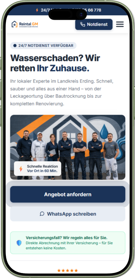
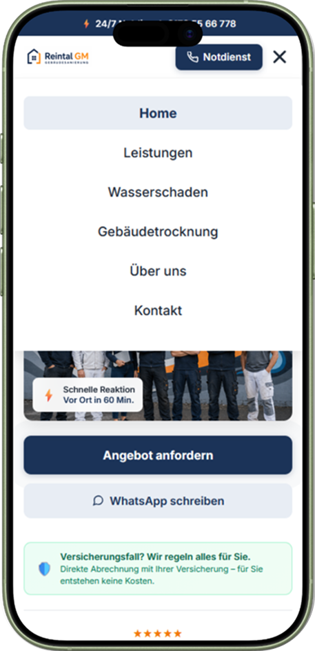
UX/UI concept & website development for a building management company · Concept Project

Reintal GM
Website Concept & Implementation

How can a website for a modern building management company be designed so visitors quickly understand the services offered, emergency information, and contact options — especially on a smartphone?
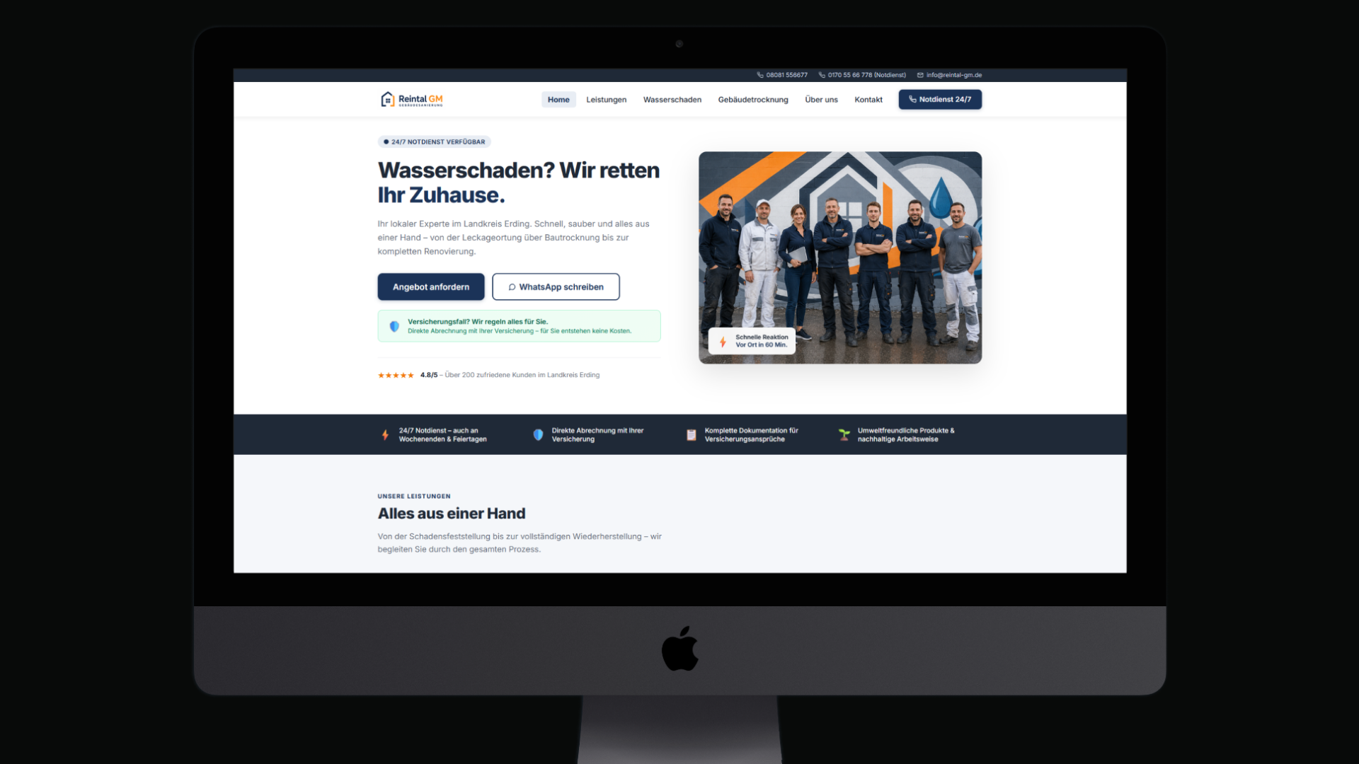
Reintal GM – Website Concept & Implementation
UX ResearchInformation ArchitectureConversion OptimizationReactVite
01 · Project Context

Orientation & Starting Point

For this concept project, a standalone web presence was developed for a fictional building management company. The focus was on a clear information structure, fast orientation, and especially easy use on mobile devices.

Industry
Building Management · B2C
Task
Website Concept & UX Strategy
Role
UX Strategy · Design · Dev
Stack
React · Vite · Figma
02 · The Idea

The Idea

People rarely visit the website of a building management company in a relaxed situation. Usually there is concrete damage, time pressure, and the next step has to be clear immediately.

So the website was not conceived as a classic company presentation, but as a guided information and contact structure: services must be graspable at a glance, relevant information reachable without detours, and the next step unambiguous at all times.

Every further decision in this concept follows from that assumption.

Emergency contact hidden away
On many building-management websites the most important number sits in the footer or takes several clicks to find — exactly where there's no time to spare in an emergency.
Only one way to get in touch
Often there is only a form, with no alternative for people who would rather call right away or send a photo over WhatsApp.
The insurance question stays open
Cost coverage is rarely addressed early — uncertainty about the bill lingers all the way to the first call.
No clarity on what happens next
After the first click, there's often no orientation about what happens next or how long it takes.
03 · Principles in the Concept

Principles in the Concept

Four principles follow from that starting idea, and they determine the structure of the entire website. Each one is implemented in the finished site and evidenced here directly on the interface.
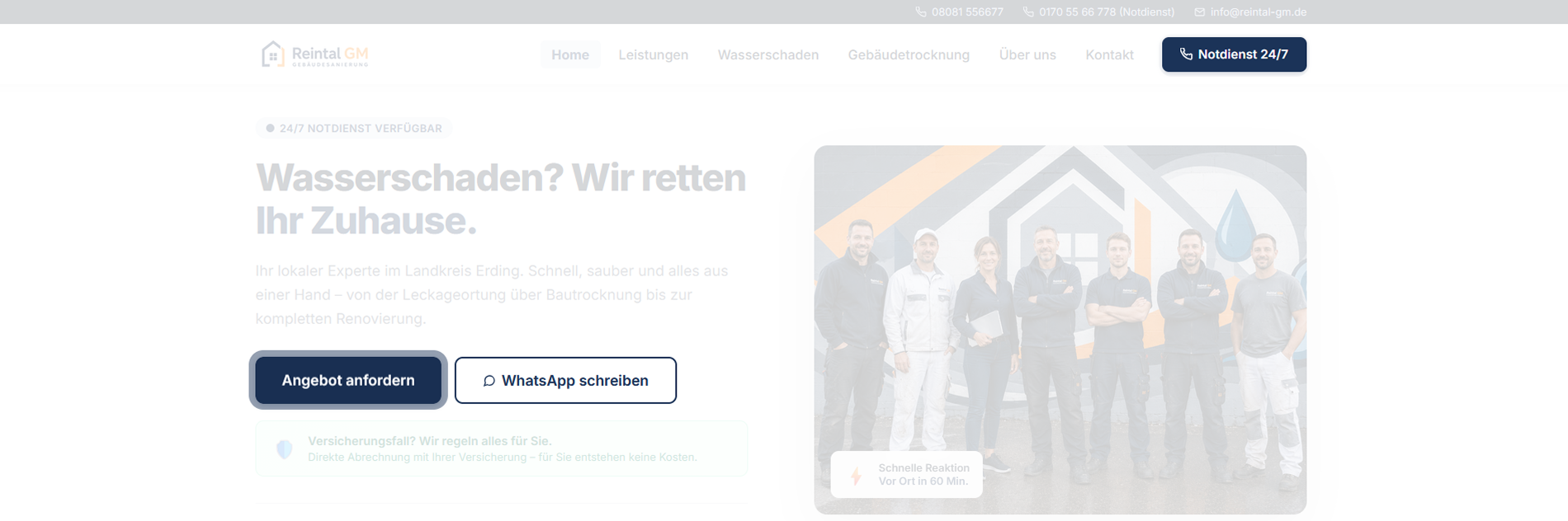
// 01
Emergency contact without detours
Principle
The most important contact path belongs in the most visible place — not in a submenu.
Why
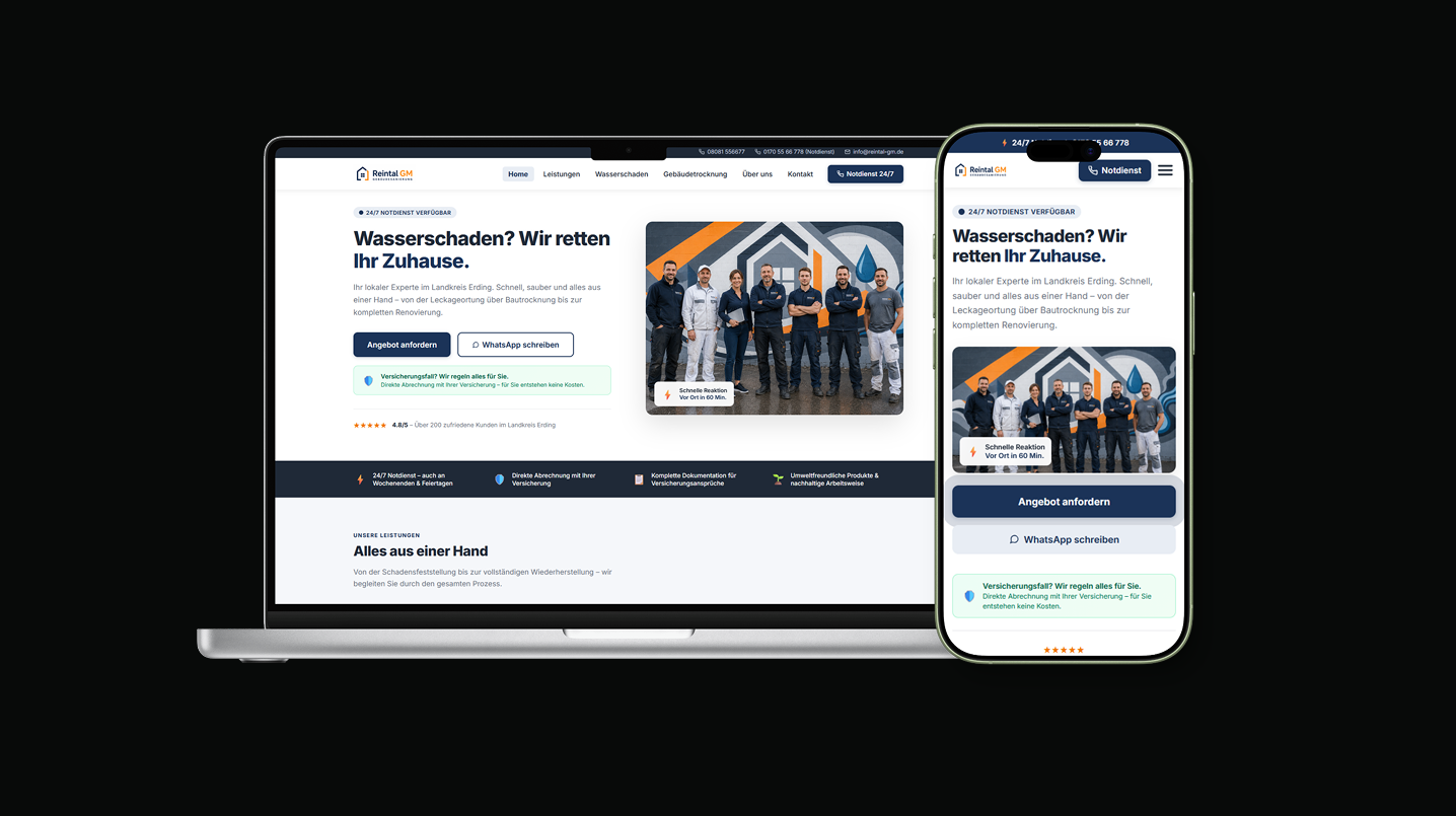
Someone with water damage is not looking for company history, but for a number. The emergency number therefore sits permanently in the top bar, plus as its own button with direct dialling. The navigation stays flat.
Emergency number and direct dialling permanently in the header
// Emergency number and direct dialling permanently in the header
// 02
Several equally valid contact paths
Principle
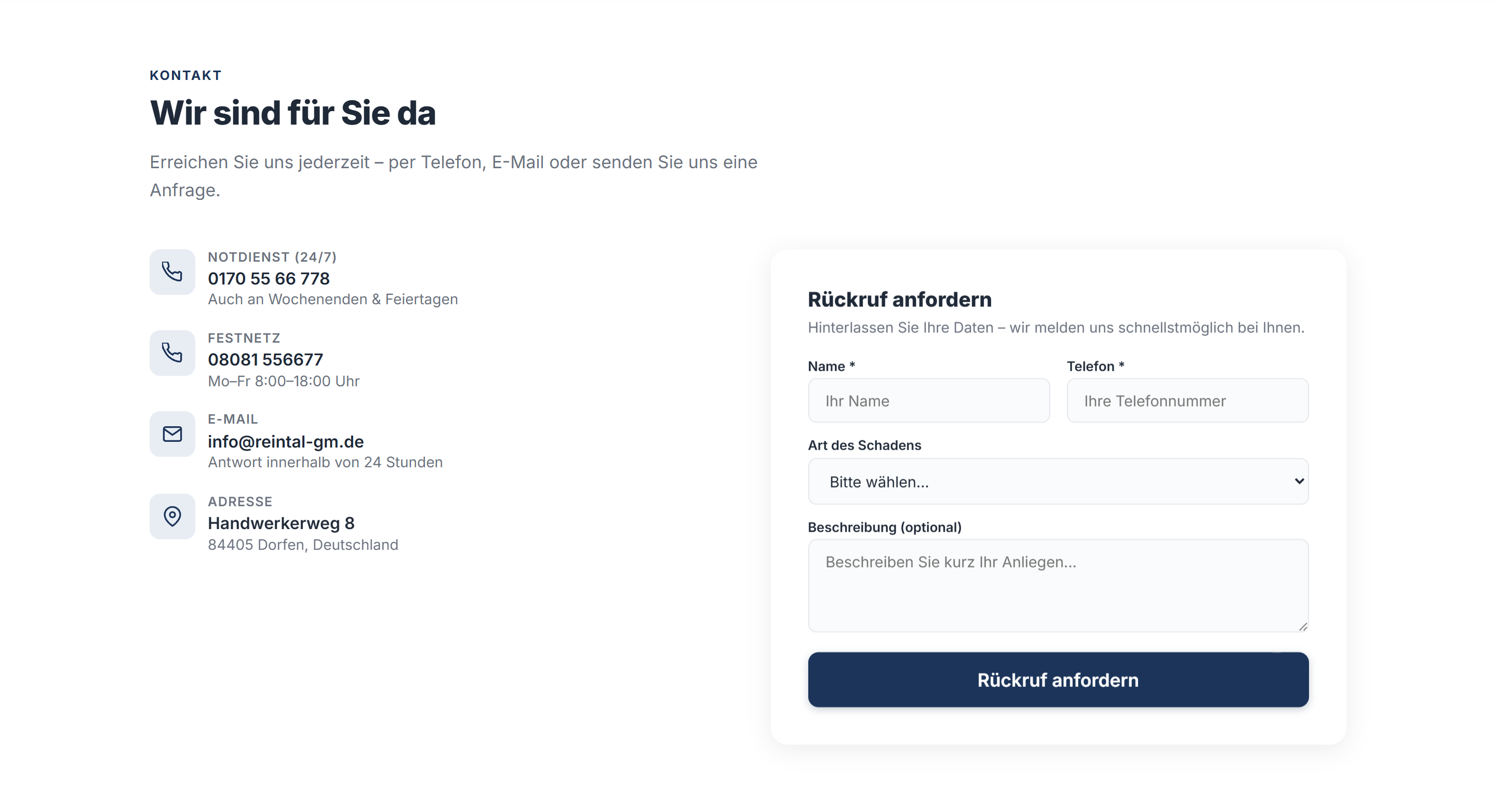
Different people act differently — phone, WhatsApp and form stand side by side as equals.
Why
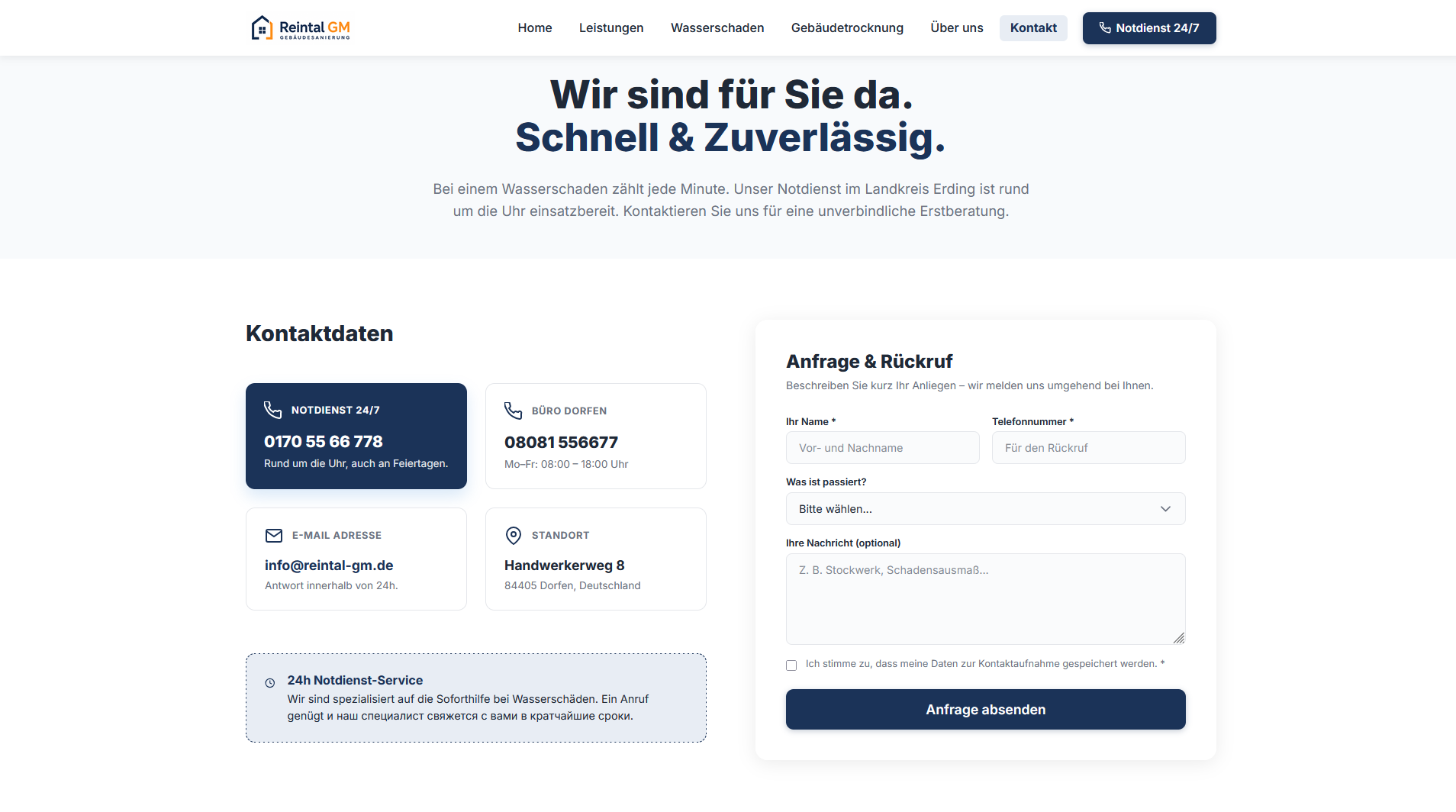
Not everyone wants to make a phone call under stress. The WhatsApp button opens a pre-written message, so the damage can be described directly with a photo. Every channel states when it is available.
Three contact paths with clear availability information
// Three contact paths with clear availability information
// 03
Trust in the insurance case
Principle
The cost question is answered before it is asked.
Why
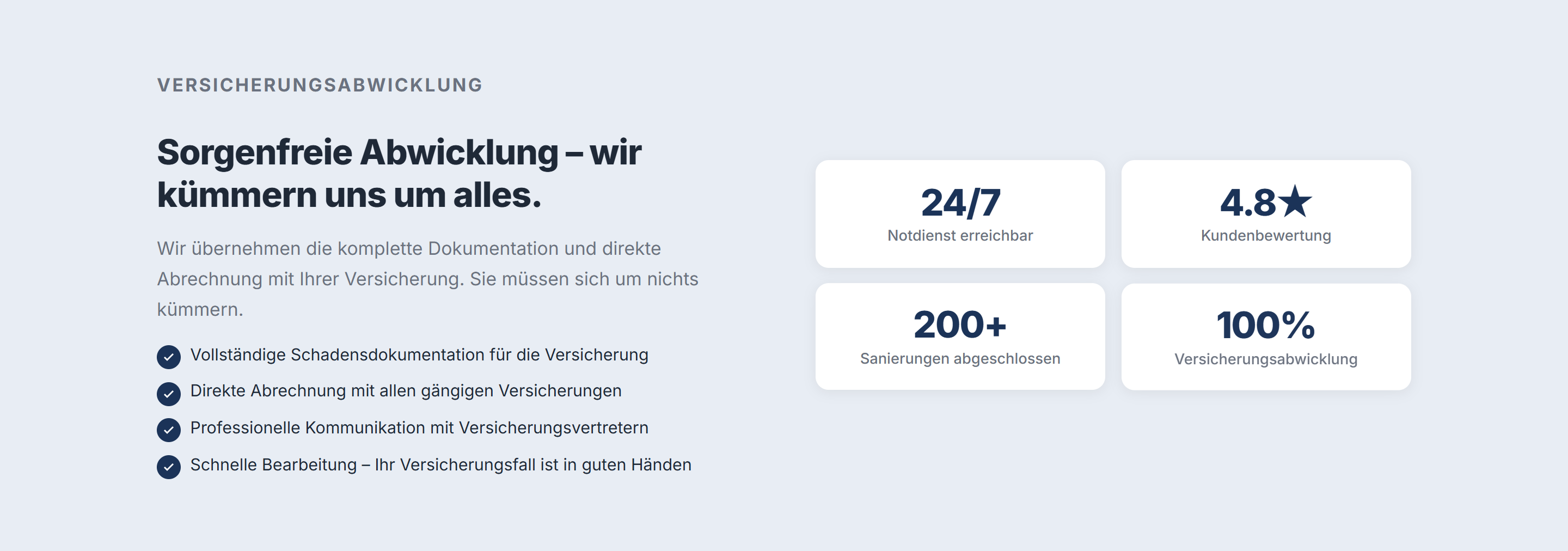
The biggest uncertainty after damage is not the repair, but the bill. Direct settlement with the insurer is therefore promised in the first screen and explained in detail in a dedicated section.
A dedicated section on insurance handling
// A dedicated section on insurance handling
// 04
Orientation about what happens next
Principle
Users should know what happens after the call.
Why
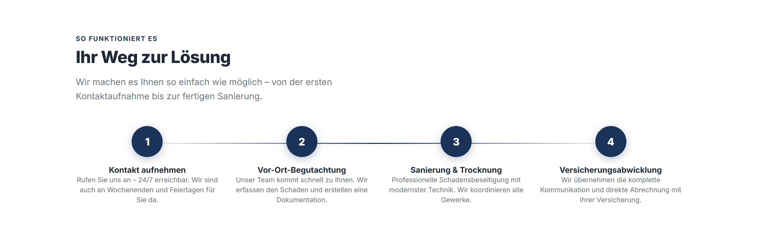
Uncertainty about the process is one of the biggest hurdles before first contact. Four clearly named steps — from getting in touch to insurance settlement — remove that uncertainty up front.
„Ihr Weg zur Lösung“ — four comprehensible steps
// „Ihr Weg zur Lösung“ — four comprehensible steps
04 · Design Process

The Process

01
Discovery & Audit
Analysis of requirements, audience research, and topic prioritization. Identification of the central UX themes.
02
Information Architecture
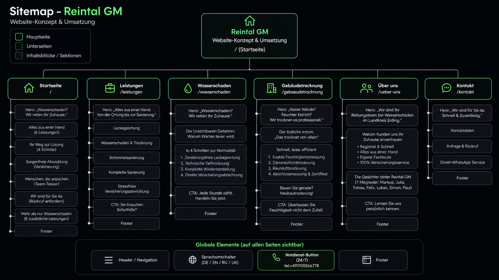
Sitemap and user flows defined — which content on which level, and in what order it is presented.
Information Architecture
03
Wireframing & Prototyping
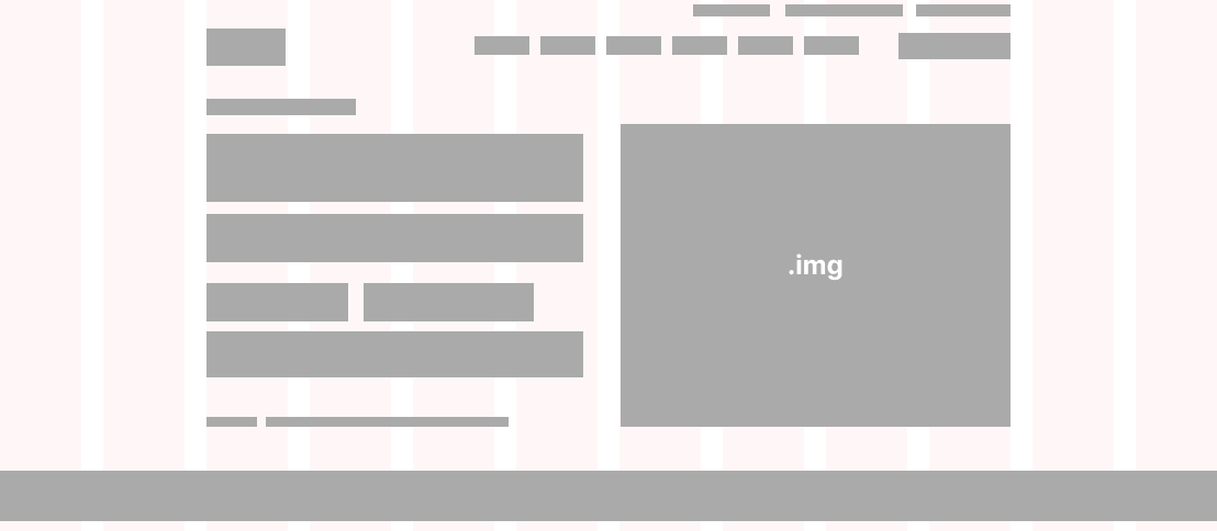
Low-fidelity wireframes in Figma — structural decisions tested before visual design began.
Wireframing & Prototyping
04
High-Fidelity Design & Development
Final design in Figma, then clean implementation in React + Vite with a mobile-first approach and performance optimization.
High-Fidelity Design & Development
05 · UX Solution

The Final Result

Visual proof — the final design in full quality.
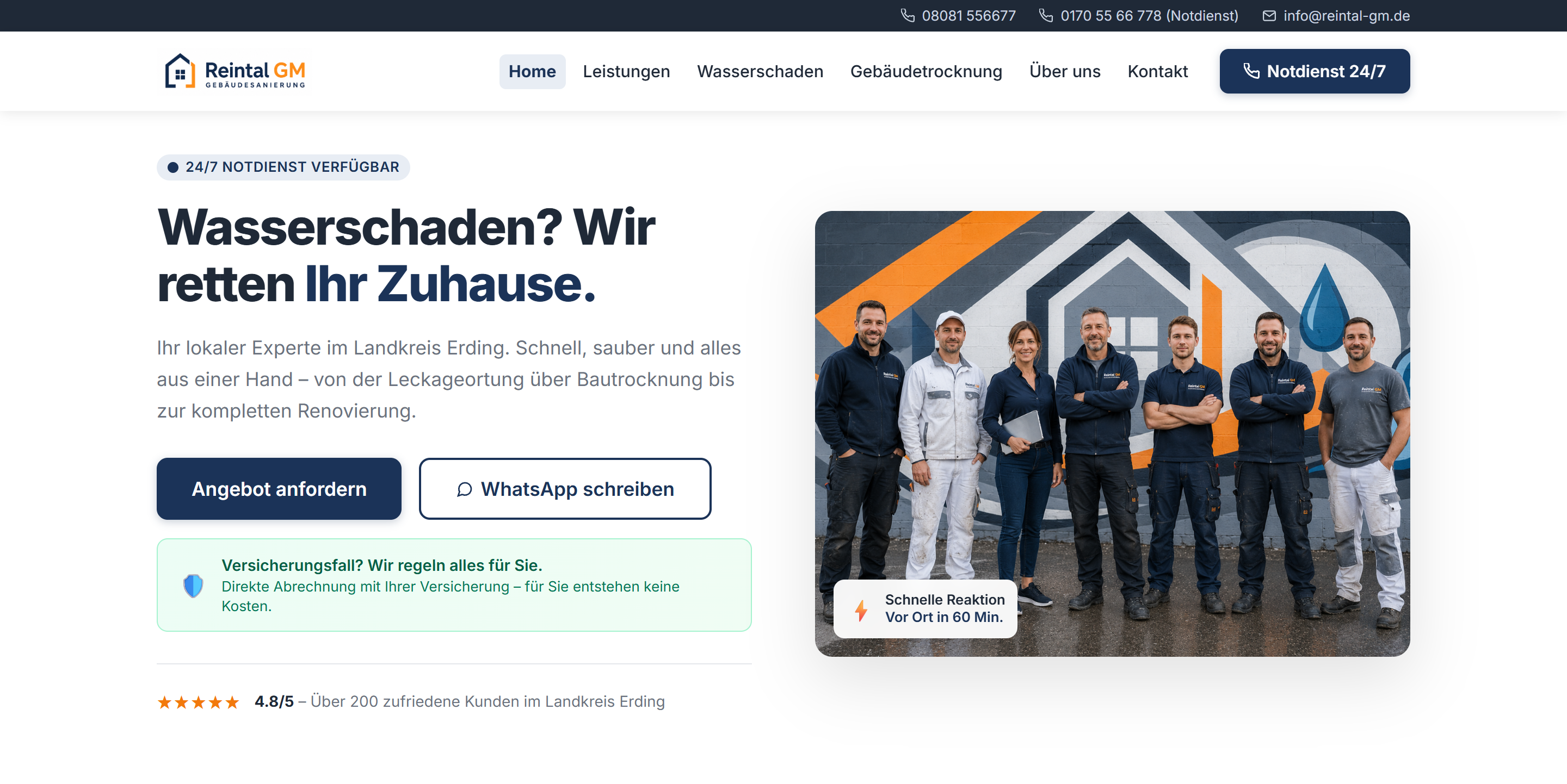
Hero Section
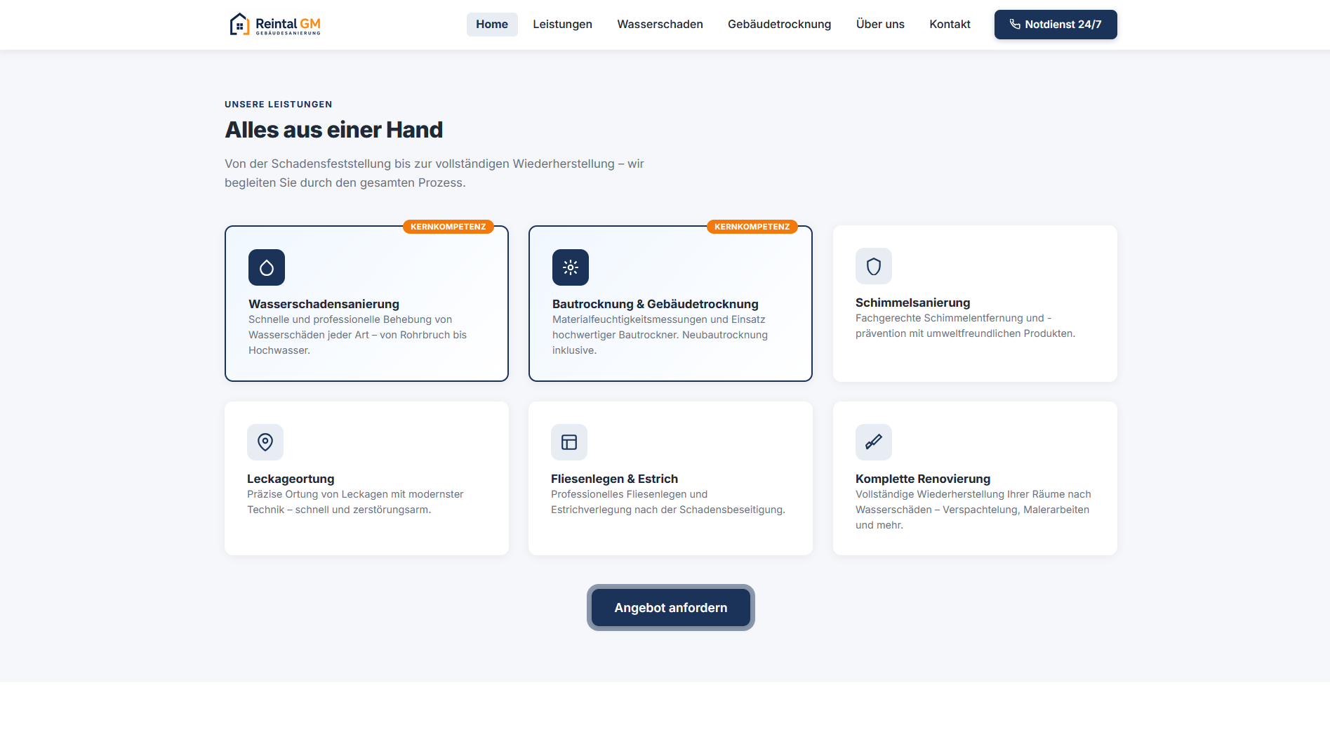
Service Structure
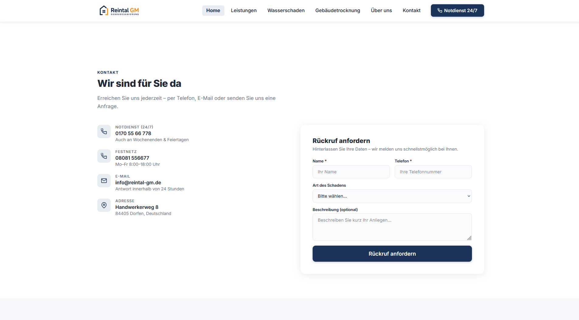
Contact Area
Contact & Footer
06 · Mobile Experience

Mobile Experience

The website was designed with a mobile-first UX approach to ensure fast access to services and contact options.
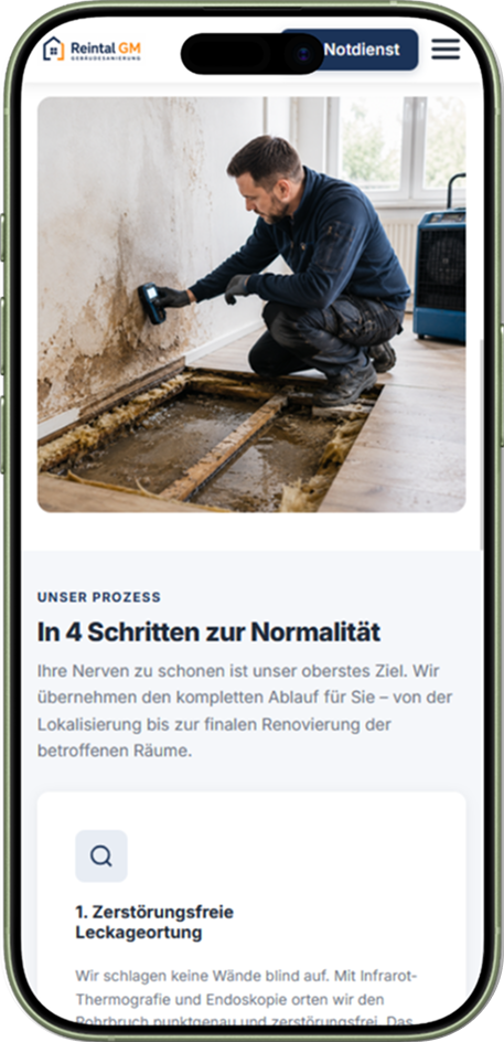
Approach
Mobile-First Design
Contact
1 Tap entfernt
Performance
Optimierte Ladezeit
07 · Impact

Delivered Value

The concept combines clear information architecture, direct contact paths and mobile-first user guidance into a digital presence tailored to the concrete requirements of a building management company.

Clear Service Structure
All services are grouped into comprehensible categories — from emergency response to full renovation.
Direct Contact Guidance
Phone, WhatsApp and callback form are offered as equals and reachable from any position on the page.
Trust-Oriented Communication
Insurance handling, process and team are built as their own content layers rather than a footnote.
Mobile-First User Guidance
The mobile view is designed as the primary entry point, not as a shrunk-down desktop variant.
Consistent Visual Language
A coherent system of color, typography and components across all pages and breakpoints.

Your services are complex. Your website shouldn't be.

Clear structures, mobile user guidance and direct contact paths — designed for the everyday reality of your customers.

Discuss a project