01 · Project Context
Orientation & Starting Point
FitHub Sport Club is a product concept for a modern fitness club. The goal was to create a complete multi-page platform, from homepage to online shop, with every UX decision grounded in real user needs.
The club concept includes personal and group training, multiple membership plans, a protein bar, changing rooms with free towels, trainer profiles, a merch shop, and an active Instagram-driven community.
Industry
Produktkonzept · B2C
Task
UX/UI Design · Multi-Page
Role
UX Strategie · Design · System
02 · Requirements
What the platform must deliver
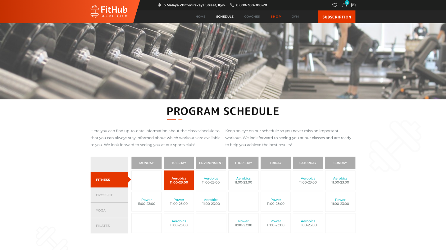
→Present both personal and group training with certified coaches
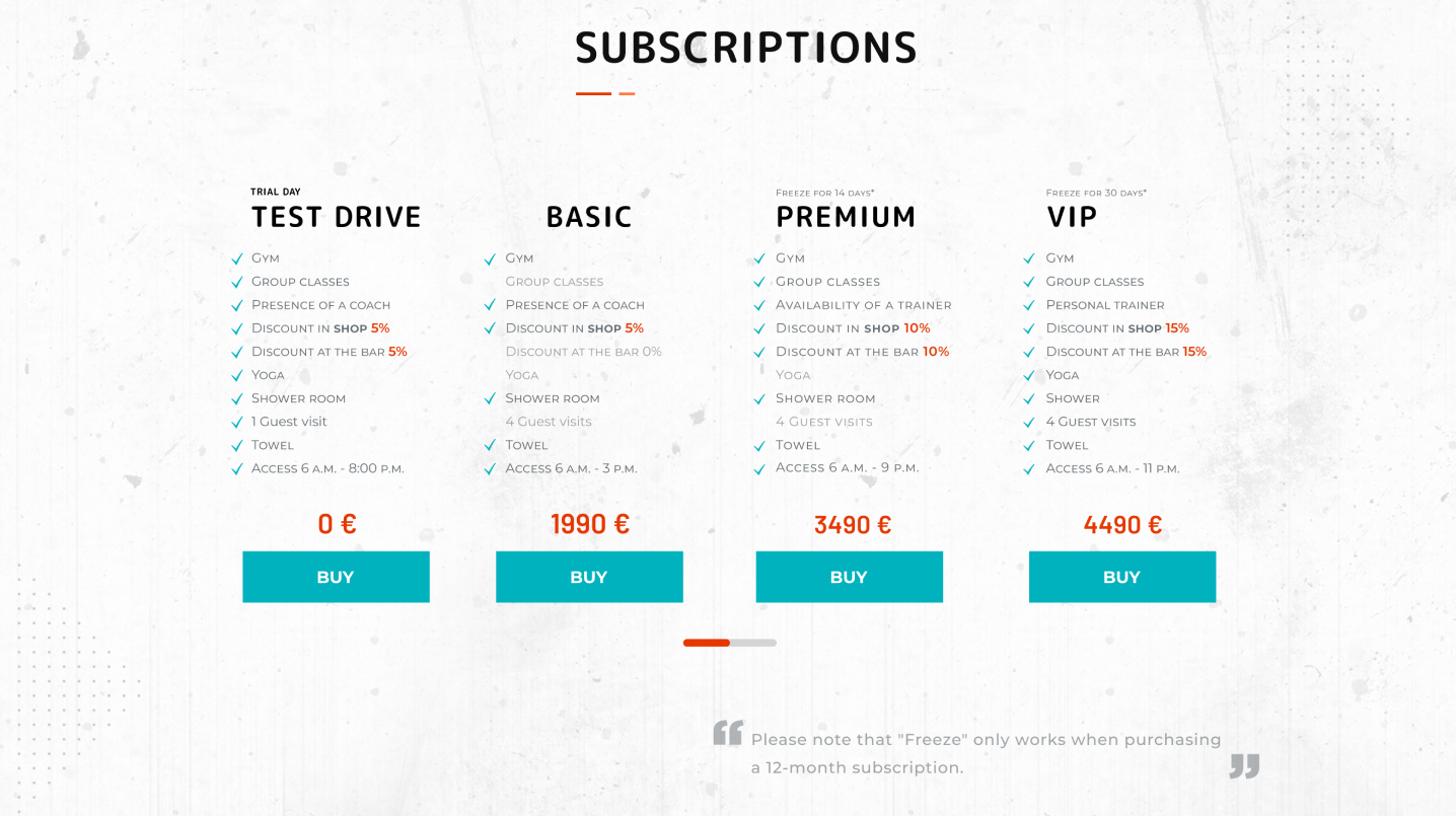
→Multiple pricing models: Test Drive, Basic, Premium, and VIP
→Distinct training programs such as Strength, Fitness, CrossFit, Yoga, and Pilates
→Facilities including changing rooms, showers, free towels, and a protein bar
→Community section and Instagram integration
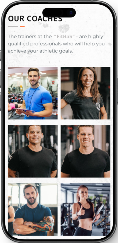
→Coach catalogue with individual profile pages
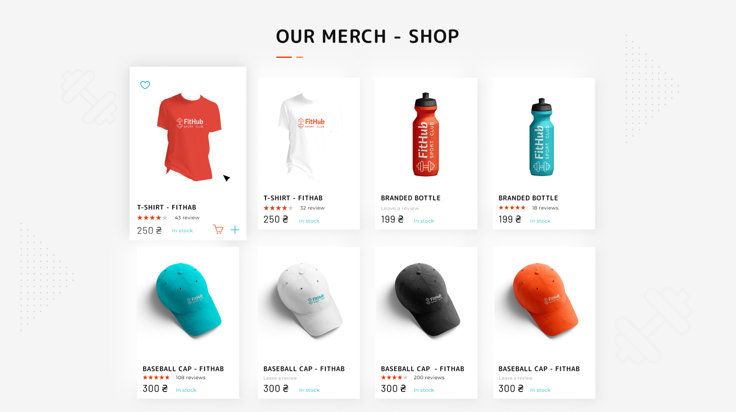
→Merch area for shirts, accessories, and supplements
→Clear location messaging, just 5 minutes from the subway
→Lead-capture contact form for callback requests
03 · UX Analysis
Structure over Complexity
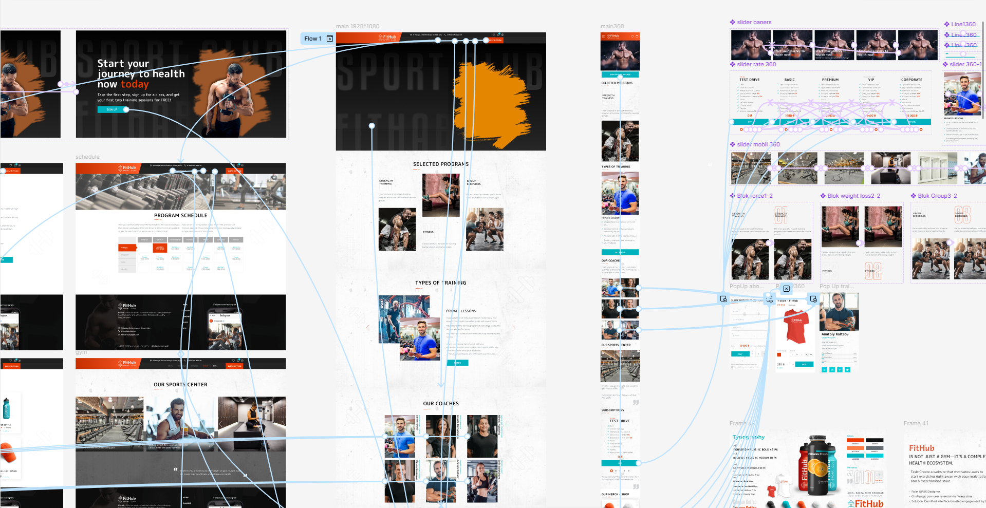
The core UX question was how to place schedules, pricing, shop, coaches, and facilities on one website without overwhelming the user. The answer was a clear information architecture with dedicated pages and a strong visual system.
// 01
Clear page structure
Home, Schedule, Coaches, Shop, and Gym
// 02
Sticky navigation for instant access to booking and cart actions
Sticky navigation for instant access to booking and cart actions
// 03
Separation between discovery on the homepage and action on detail pages
Separation between discovery on the homepage and action on detail pages
// 04
Visual hierarchy using teal for CTAs and orange as the energy accent
Visual hierarchy using teal for CTAs and orange as the energy accent
Information Architecture & Layout Structure
04 · Design System
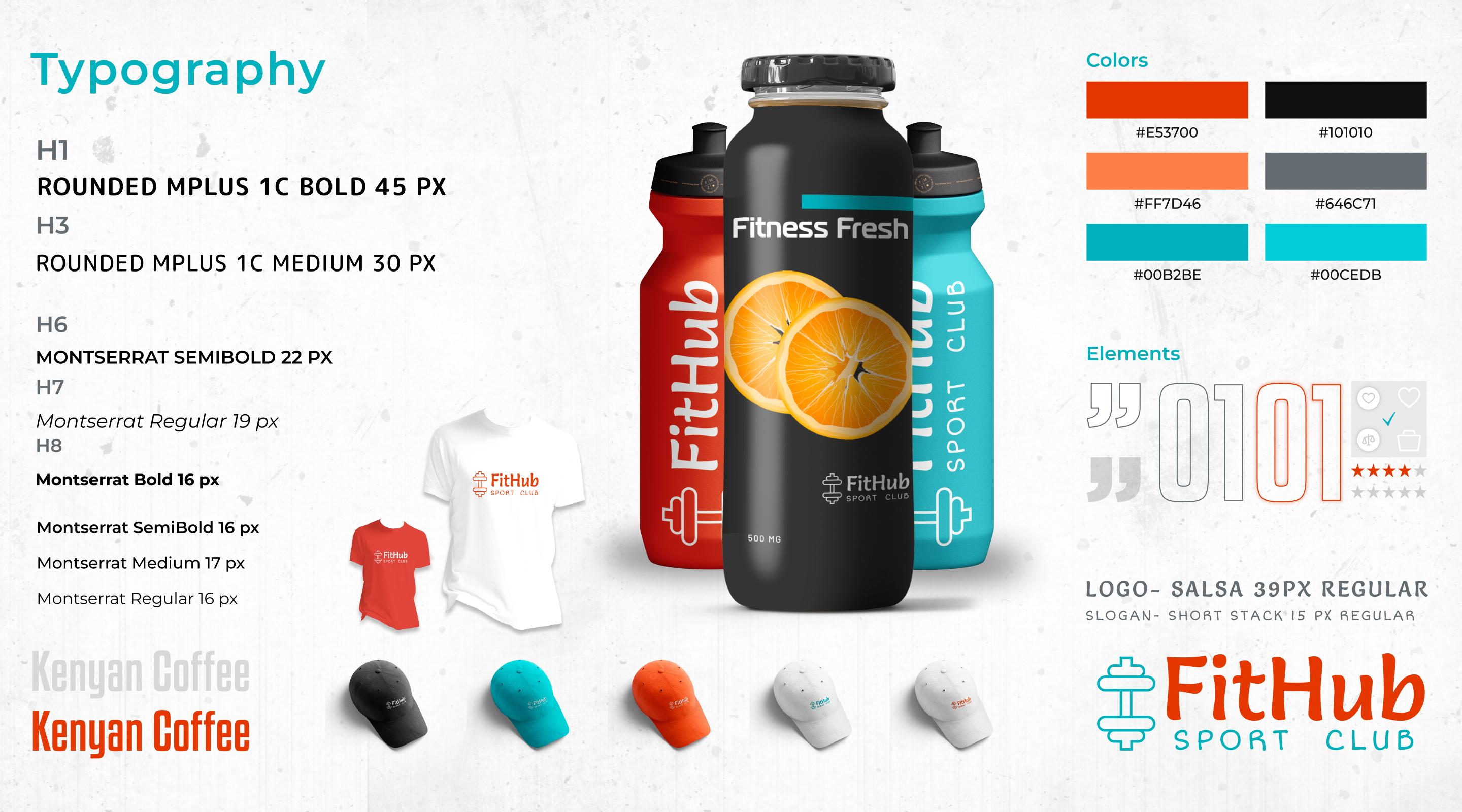
Teal & Orange Identity
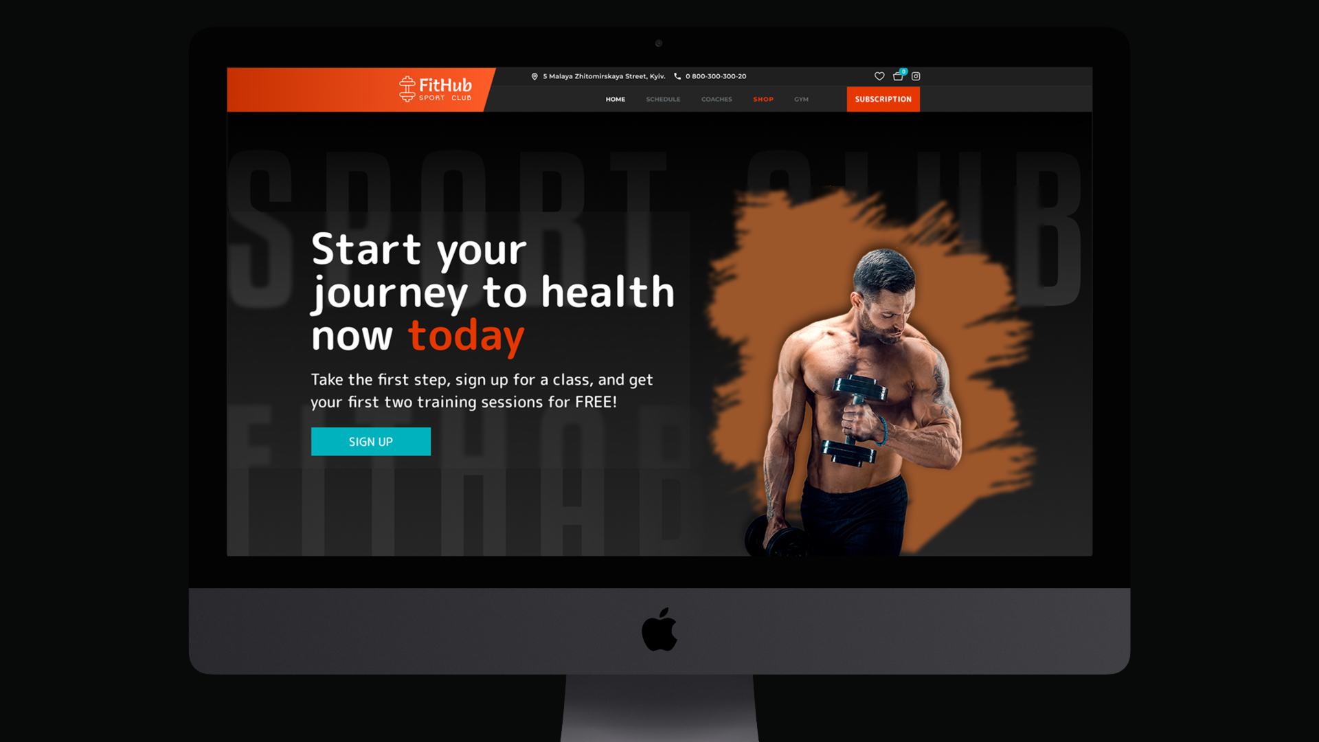
The FitHub name and visual identity were developed specifically for this concept. The logo combines a dumbbell icon with geometric typography. Teal communicates trust and action, while orange-red brings energy and momentum across dark hero areas and lighter content sections.
Primary Color — Trust & Action
Teal — Booking CTAs, Navigation, Trust Elements
Accent Color — Energy & Dynamics
Orange-Red — Highlights, Training Programs, Badges
Logo
Dumbbell Icon + geometric typography. Strong, recognizable, sporty.
Background Rhythm
Dark Hero areas alternate with bright content sections — a visual breathing rhythm.
Design System & UI Components
05 · Strategy
User Journey as Foundation
The strategy followed the user journey principle: Inspire, Inform, Convince, Convert. Each page plays a clear role inside that funnel.
01Hero section with strong positioning and clear CTA guidance
02Dedicated pages for Schedule, Coaches, Shop, and Gym instead of one overloaded homepage
03Pricing logic built around four membership models with distinct value framing
04Community elements, social proof, and contact touchpoints across the journey
06 · Design Process
From Concept to Platform
01
Defined information architecture and page structure
Defined information architecture and page structure
02
Built desktop layouts and visual hierarchy in Figma
Built desktop layouts and visual hierarchy in Figma
03
Created a reusable design system for cross-page consistency
Created a reusable design system for cross-page consistency
04
Designed mobile screens and interaction patterns in parallel
Designed mobile screens and interaction patterns in parallel
07 · Final Solution
The Platform in Full Width
Conversion-oriented landing page, structured schedule, integrated shop, and trust-building trainer profiles — all as a coherent system.
Interactive Class Schedule
08 · Mobile Experience
Mobile as an independent journey
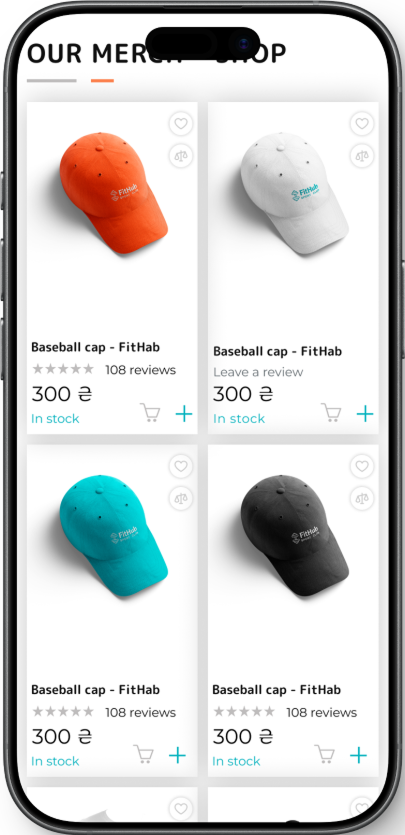
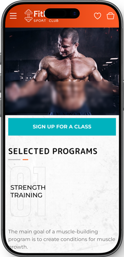
The mobile version was designed as a complete primary journey, not as a reduced companion layout.
Hamburger menu, compact product cards, and overlay booking modules deliver the same complete journey on a smartphone without losing functionality.
Quick-action header icons for wishlist and cart
Interactive merch cards with add-to-cart and detail popups
Overlay booking flow for class sign-ups instead of hard page jumps
Lead generation via modal form for newsletter and callback requests
09 · Impact
What was delivered
Not an MVP fragment — but a complete, coherent product. Each page with its own goal, all together a system.
5+
Complete Multi-Page Design
5+ connected pages including Schedule, Coaches, Shop, Gym, and Contact, each built around a specific user goal.
4
4 Membership Models Designed
Test Drive, Basic, Premium, and VIP tiers with clear visual hierarchy and conversion logic.
2×
Mobile-First Prototype
Fully responsive Figma prototype for both device classes: desktop and smartphone.
✓
Full Design System
Consistent UI components, typography, and a teal-and-orange palette applied across the entire platform.