Langner GM Website
Redesign
Conversion-oriented redesign of a service company website with improved information architecture, clearer contact flow and a structured UX funnel.
Orientation & Starting Point
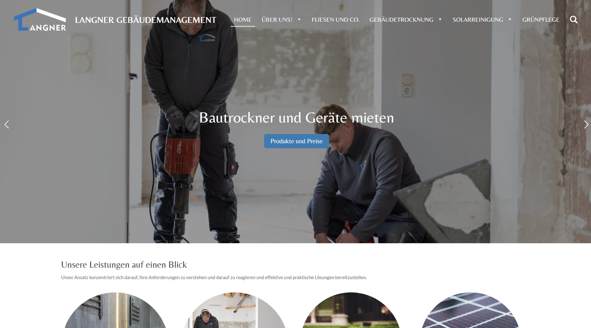
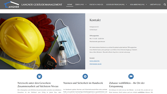
Langner GM is a local service company specializing in water damage restoration and building drying.
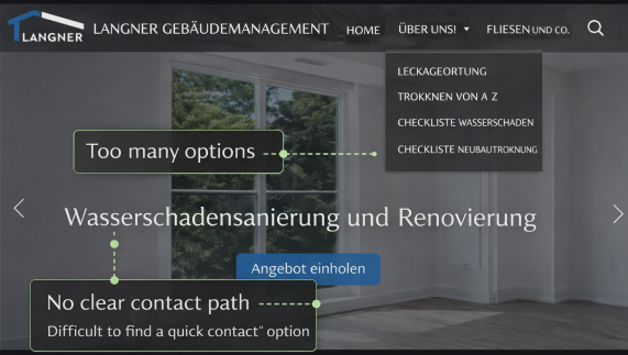
What went wrong
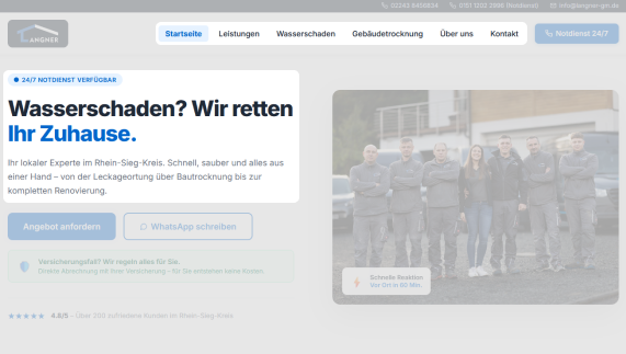
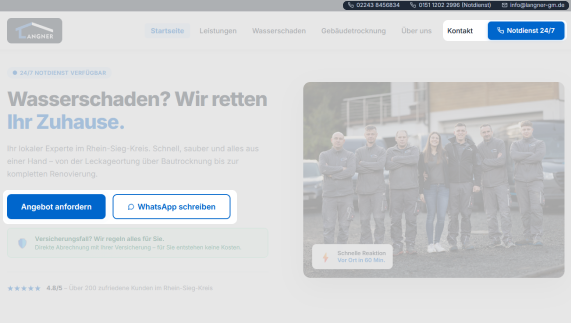
The previous website did not effectively communicate the service value and made it difficult for users to quickly contact the company in urgent situations.
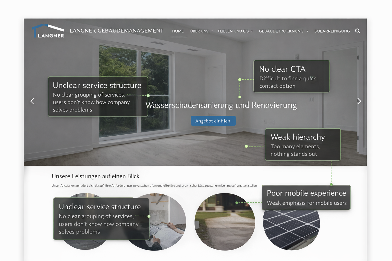
Why it failed
Structural diagnosis of core problems — not as a list of errors, but as a causal analysis: Cause → Effect → Solution.
Users needed to reach contact options within seconds, especially in emergency situations such as water damage.
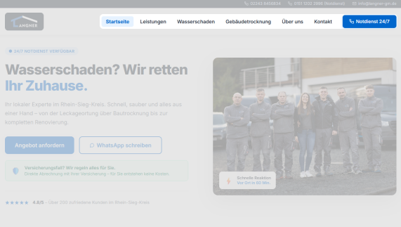
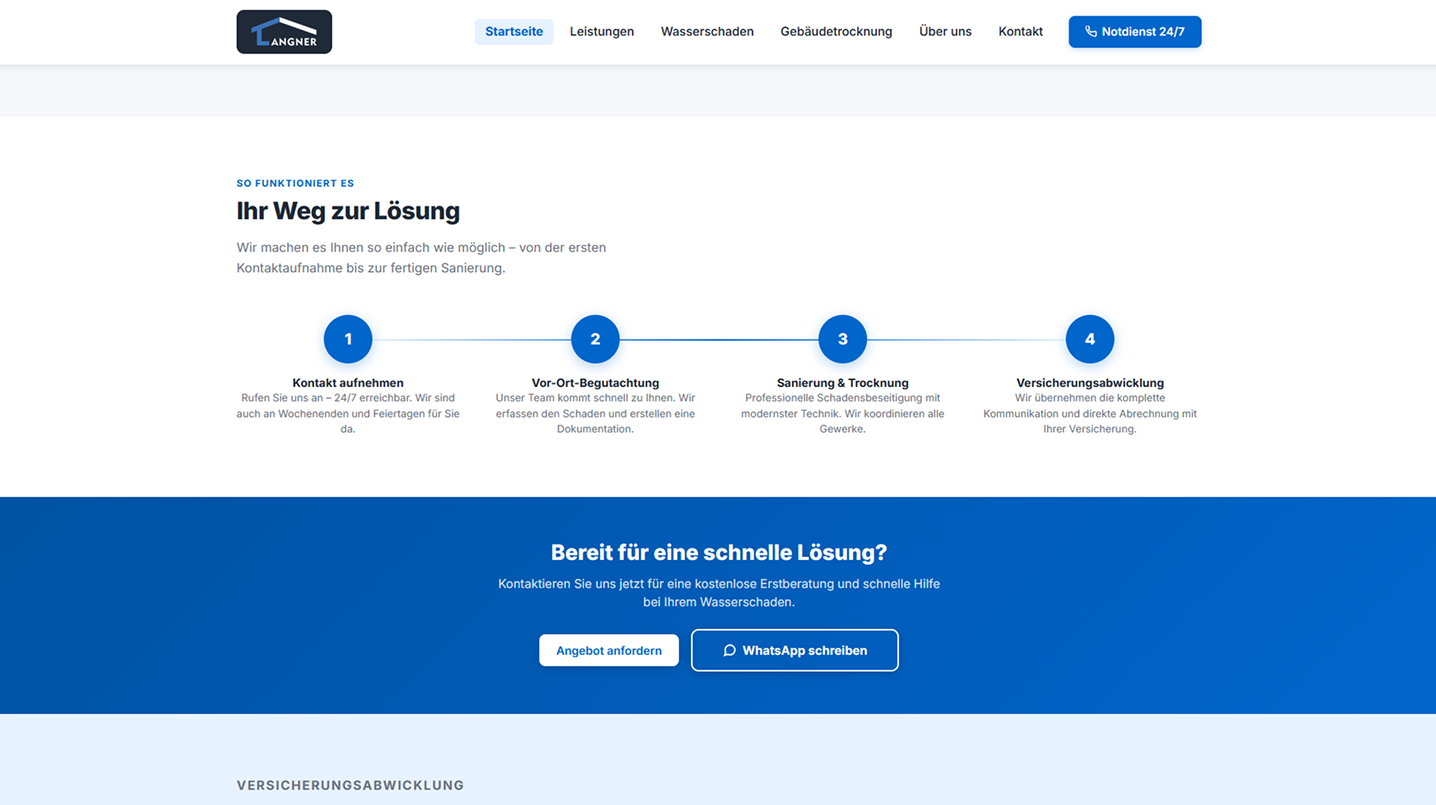
The Blueprint
Goal: Guide users directly toward contacting the company.
The Blueprint
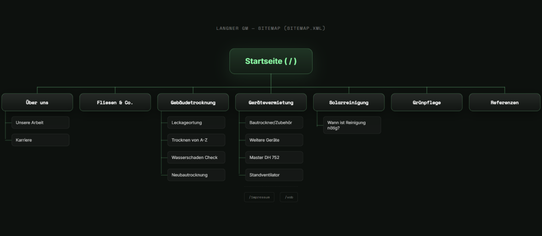

Key UX Decisions
Every decision follows a clear logic: Problem → Solution → Measurable Effect.
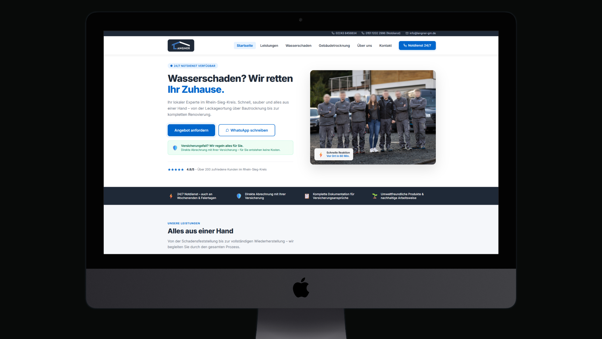
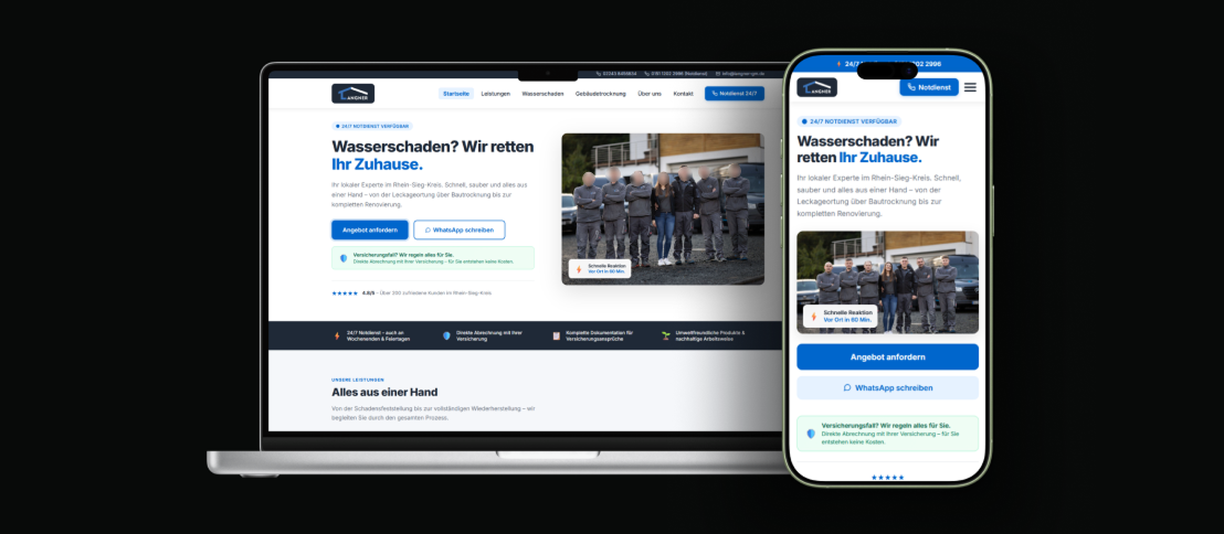
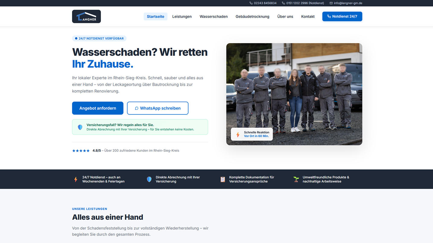
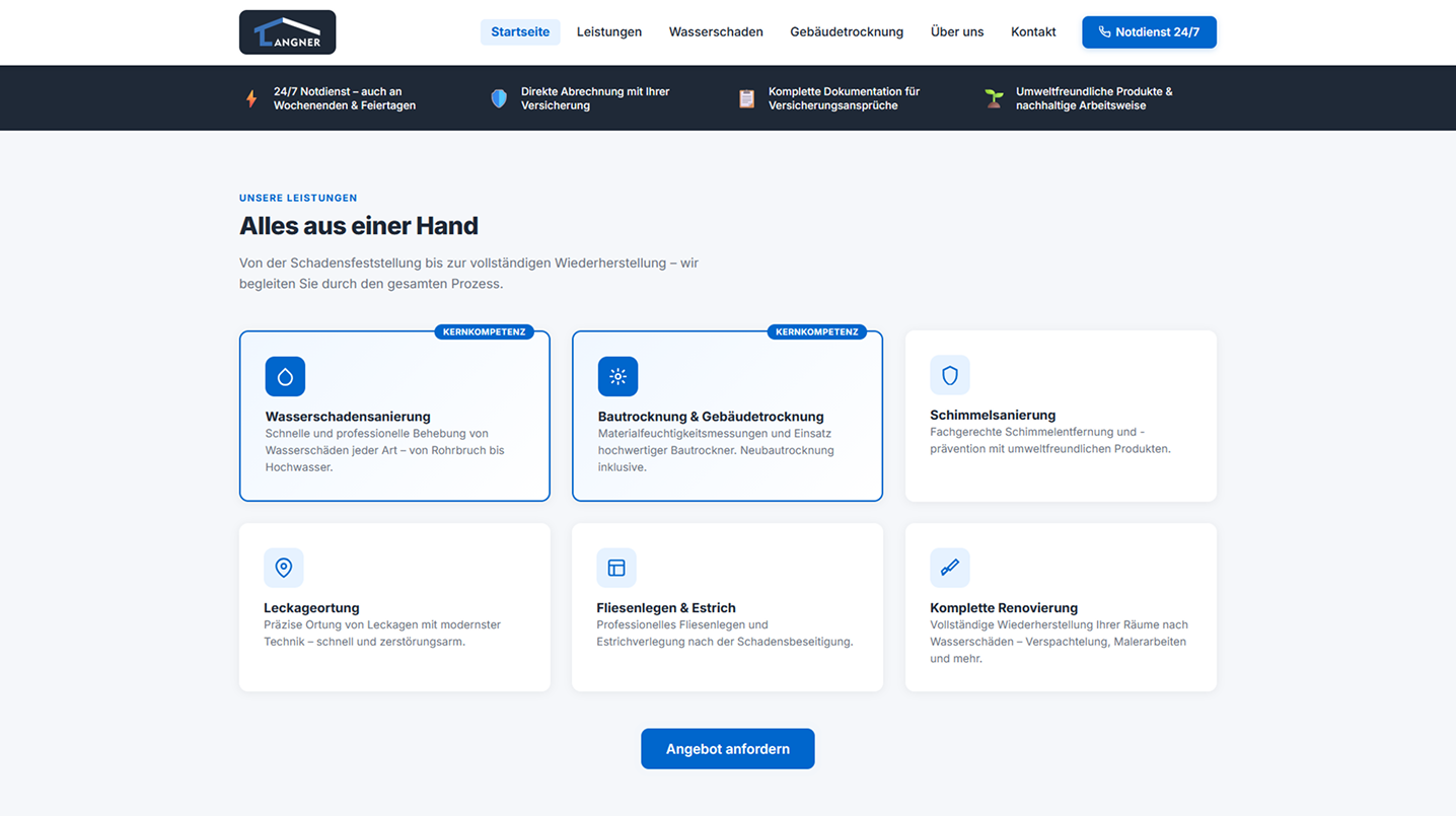
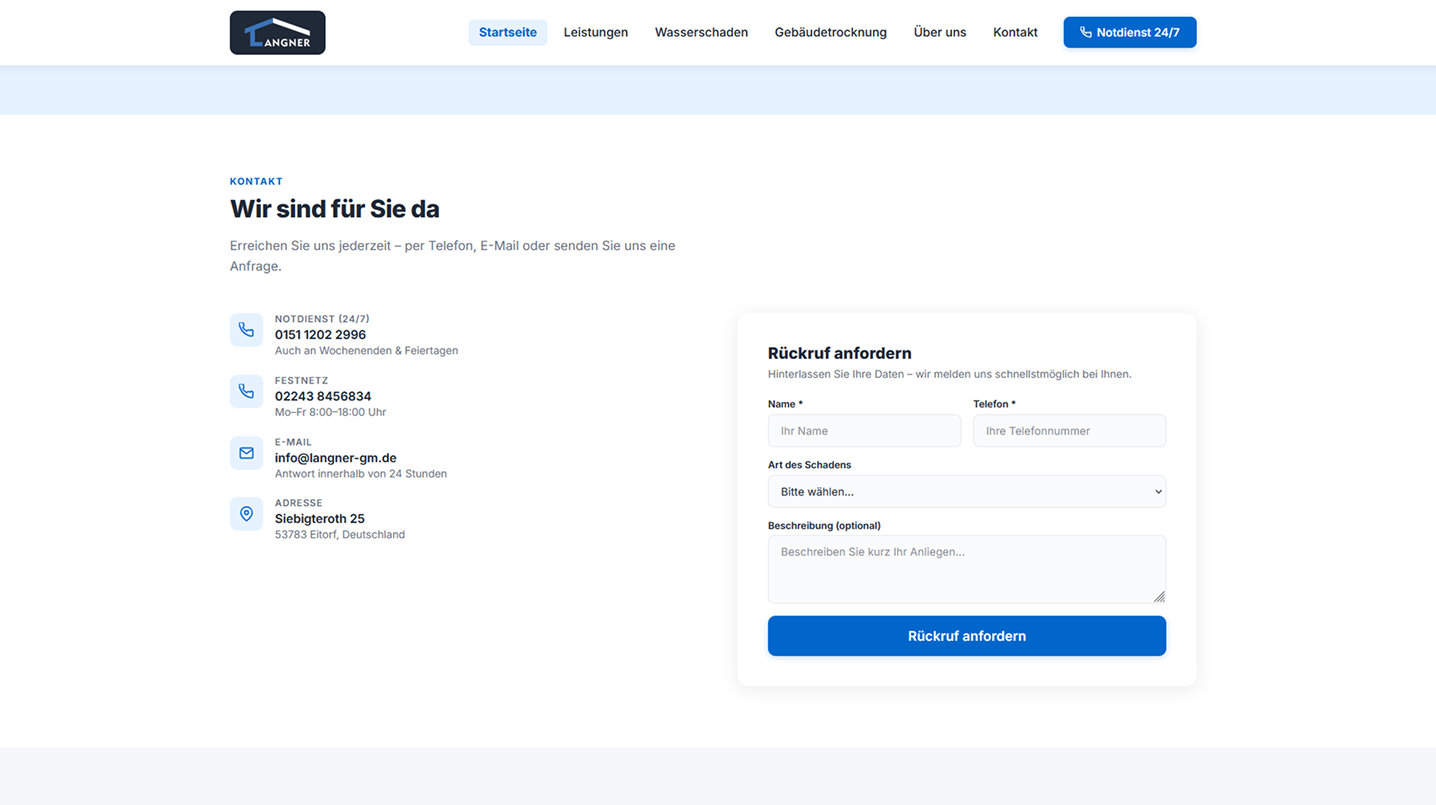
The Final Result
Visual proof — the final design in full quality.
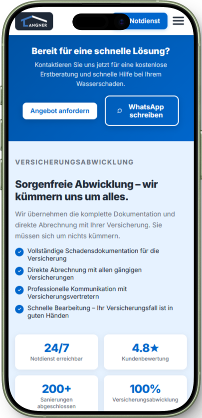
Mobile Experience
The website was redesigned with a mobile-first UX approach to ensure fast access to services and contact options.
 Hero Section
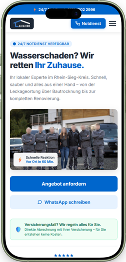 Service Structure
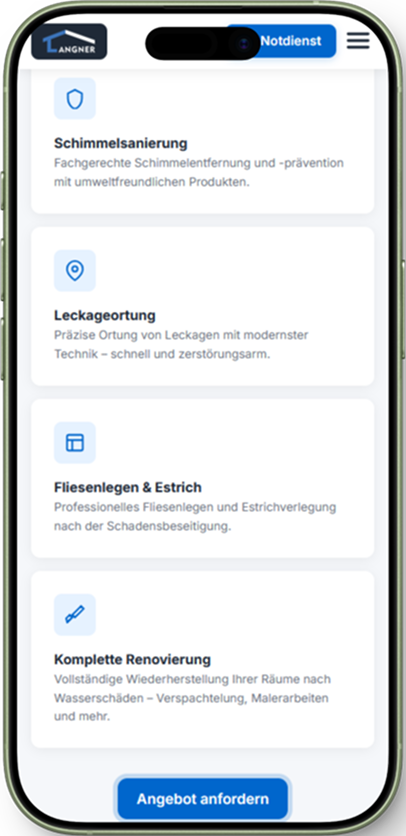 Contact Area
Product Communication
To support the overall communication of the business, a short promotional video was created. The goal was to give potential customers a clear and immediate understanding of the company, its services and how the process works — especially in urgent situations like water damage.
Delivered Value
The redesign focused on improving clarity, trust and conversion through better structure and positioning.
Discuss a Project
Let's find out together how UX and clear information architecture can improve your product.
Start Strategy Session