Pidkazhu
From Logo to Platform
A car-repair matching service in Ukraine – from product rules and logo to a three-language website. Including a deliberate change of course: when the first design felt too flat, the entire design system was rebuilt.
Starting point & brief
The client came with a clear idea but without a name, a brand or a website. What was needed was not another directory of repair shops, but a service you trust with your car – before you hand over the keys.
The enemy is uncertainty
The problem is not choosing one shop out of ten. It starts the moment you have to leave your car with people who know far more about repairs than you do.
Trust should come before the keys change hands.
The design system opens with exactly this sentence: “We sell confidence, not repairs.”
Rules first, design second
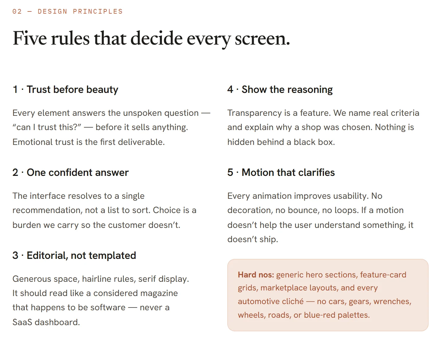
Before a single page was designed, I put the product in writing: a product constitution, the unique mechanism, the brand DNA and the core object “Bearing”. Later, these documents answered every design question – by rule, not by taste.
The trigger: the first draft
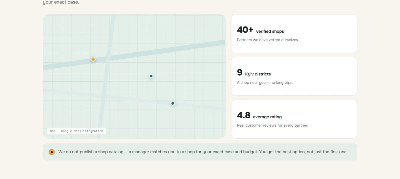
The first draft from 30 June looked like every comparison portal: stars, reviews, a map of shops, a catalogue of services. Technically clean – and the exact opposite of what the service promises. The rules grew out of that realisation.
- 01Describe the situation
- 02Talk with the manager
- 03Follow-up questions
- 04Photos or inspection, if needed
- 05Choosing the shop
- 06Checking that it can take the job
- 07Agreement with the customer
- 08Handing over the details
- 09Visit to the shop
One direction instead of a list
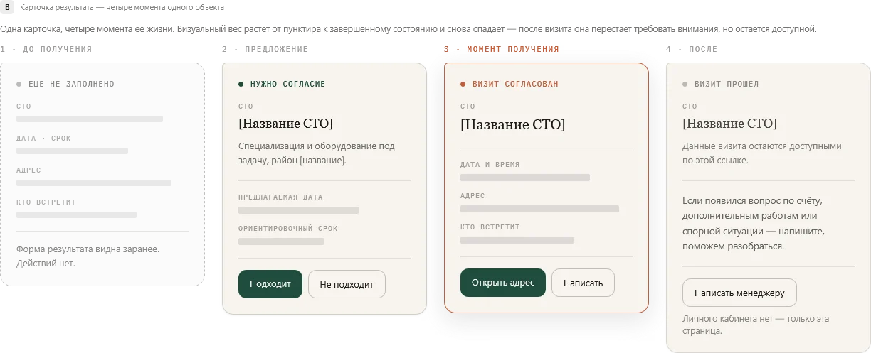
The heart of the product is called “Bearing” – a card with exactly one agreed repair shop. It always has the same fields in the same order: shop · appointment · address · who will meet you. Its visual weight grows with the request and fades again after the visit – it stays available without demanding attention.
A mark that speaks
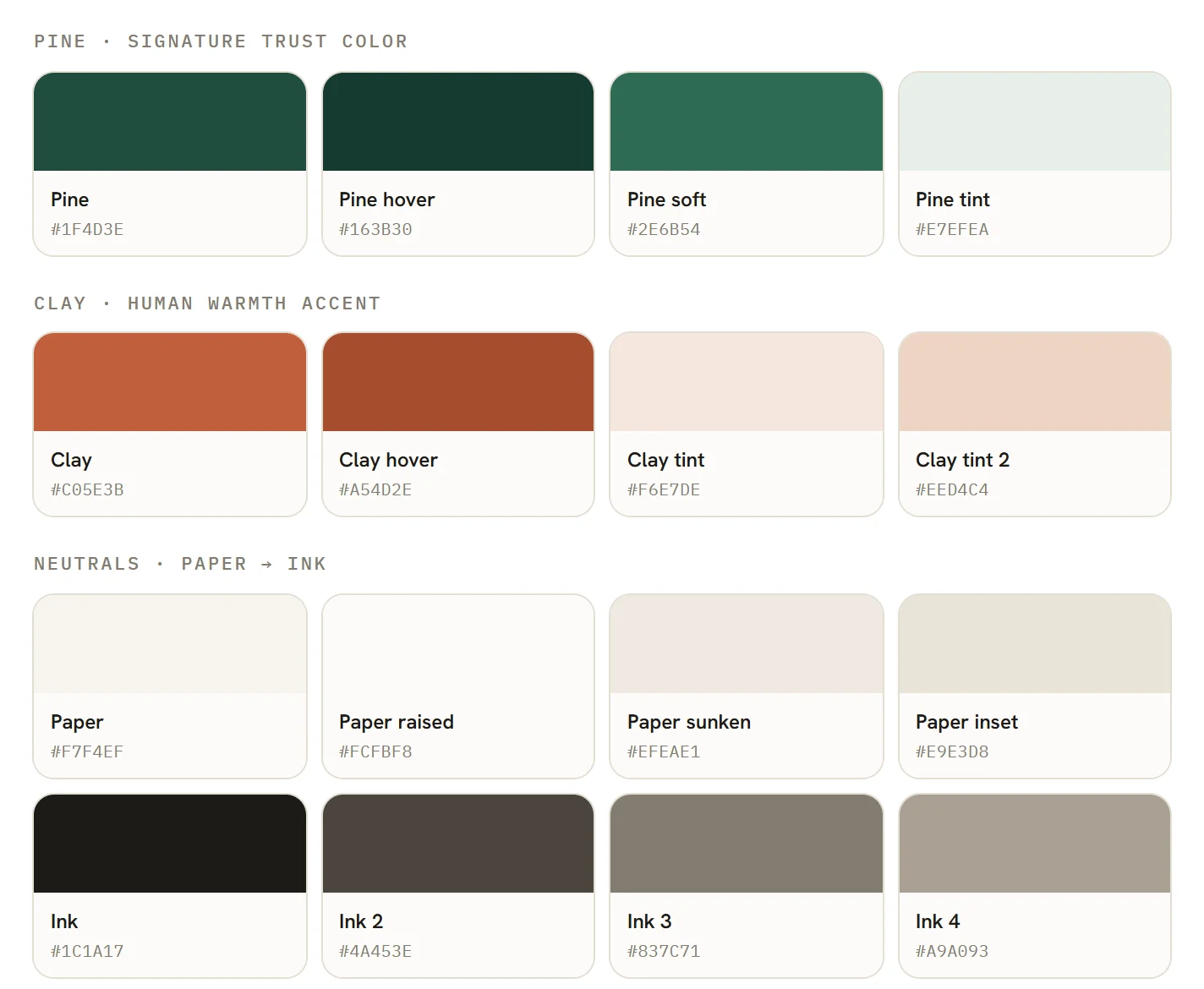
The colour search started with five calm, Scandinavian palettes. None of them was adopted as is – they led to a system of its own: warm paper, deep pine green for trust and a single clay accent for the human side. Explicitly banned: the blue-and-red of the car industry.
A design system, not a mood board
The palette grew into a complete document with 15 chapters: brand philosophy, design principles, colour, typography, grid, spacing, motion, icons, accessibility and components. Every colour and typeface in it is the same code that later runs on the website.
From wordmark to mark
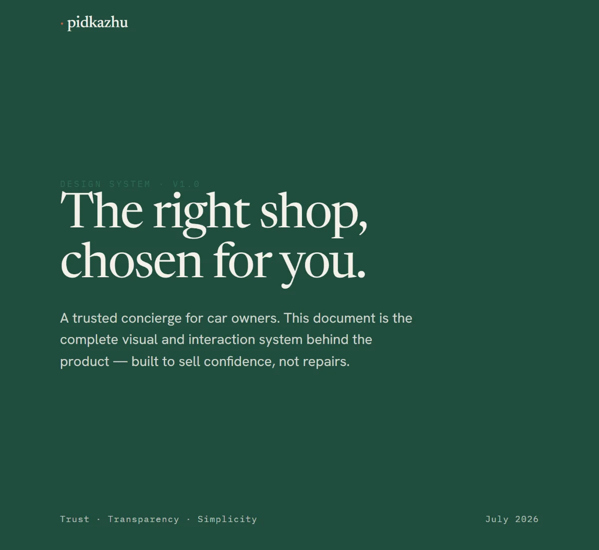
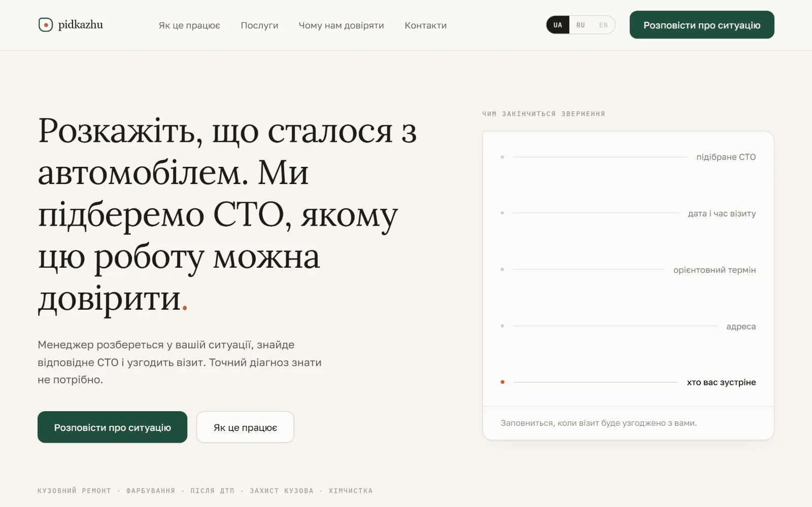
In the first draft the logo was just a wordmark: “pidkazhu” with a yellow dot at the end. The dot stayed – as the sign of an answer found. In design system v1 it became the actual mark: the spoken square with the dot in its centre.
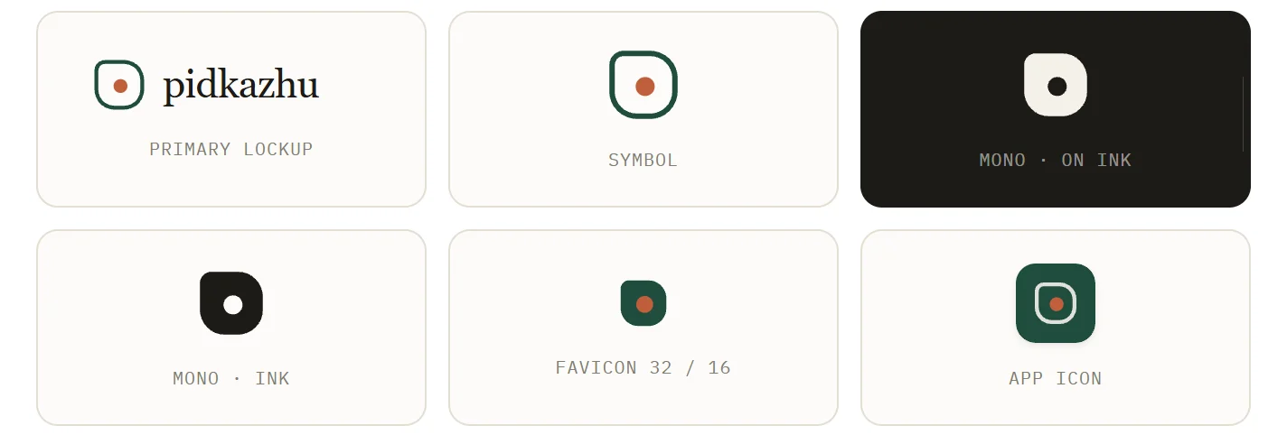
The answer: a mark that speaks
The mark is a “spoken square”: a speech bubble with a flattened top-left corner – Pidkazhu speaks. The dot in the middle stands for the answer, found. The flattened corner shapes every card on the website. Later the logo got a motion, worked out in six rounds: the dot traces the contour, peels inward and locks in the centre; then a tonal band crosses the wordmark – 2.1 seconds, no overshoot.
The approved variant V5 A3 – as it runs in the header of pidkazhu.com. In the later redesign the mark stayed – only the typeface and the shade of green were adjusted.
A won because its path is computed from the mark’s own geometry – it would not fit any other logo.
Bespoke icons, not stock
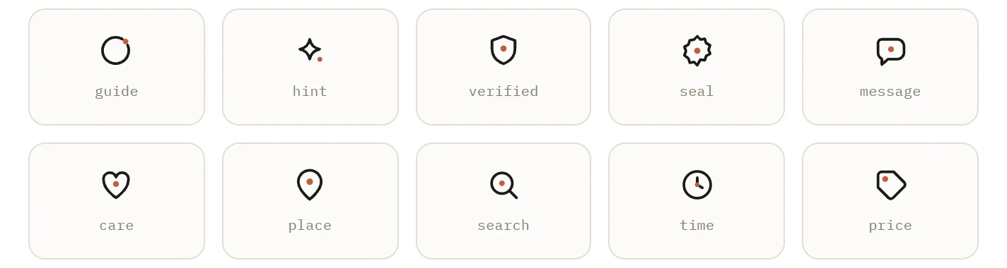
The icons were drawn too, not bought: one line family on a 24 px grid. The icons for guidance, trust and care carry the clay dot from the logo.
From wireframe to the first live version
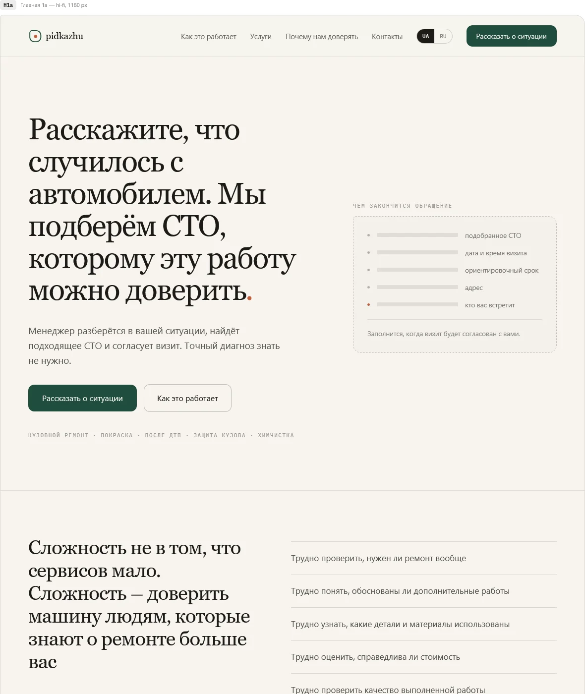
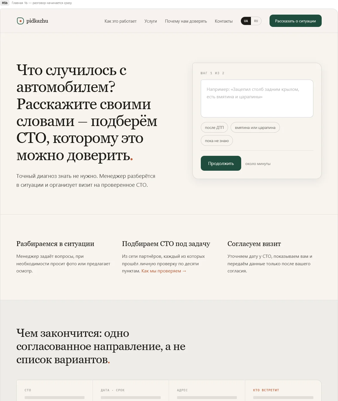
At the end of August came wireframes for two competing home pages, then a hi-fi design for desktop and mobile. Built with Astro and a custom PHP backend for the two-step request form – online on 1 September.
Motion system “Nitka” – the thread
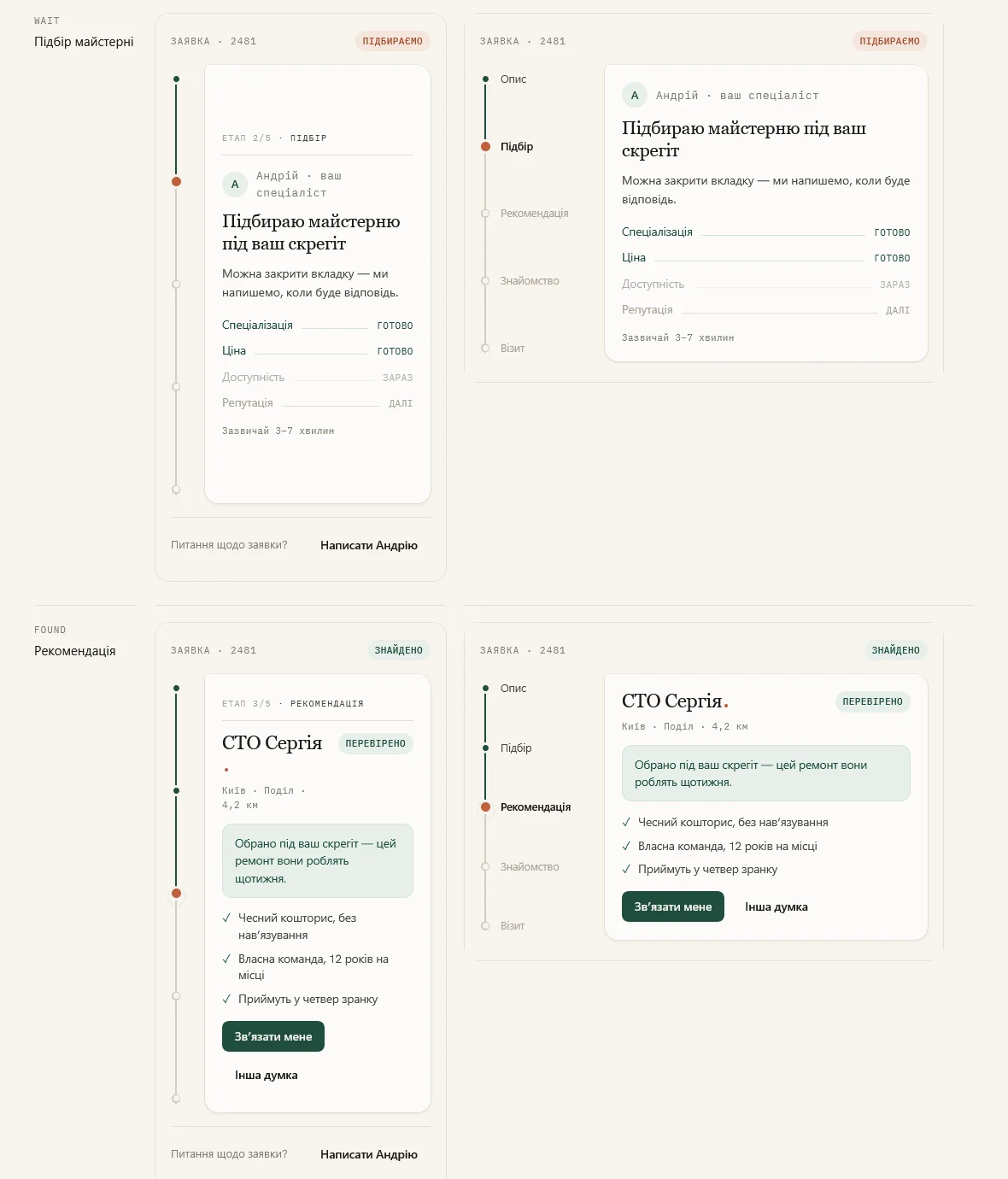
For each request’s personal page I compared three motion concepts. The “thread” won: the request moves as a dot along a line – description, matching, recommendation, introduction, visit. The customer doesn’t see separate screens but how their case moves forward.
Clean – but too quiet
The first version was tidy, and that was exactly the problem. A week after launch I audited my own home page. The verdict: product, content and logic were right – the visual language didn’t carry them.
Six iterations within the same system
What followed was a study of eight reference websites and six new variants: magazine-style numbering, dark bands, space for photos, Bearing as a common thread. Each was better than the one before – none was good enough. The insight: the problem wasn’t the layout, it was the visual language itself.
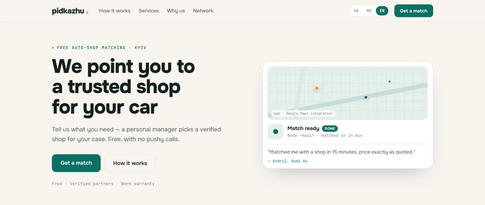
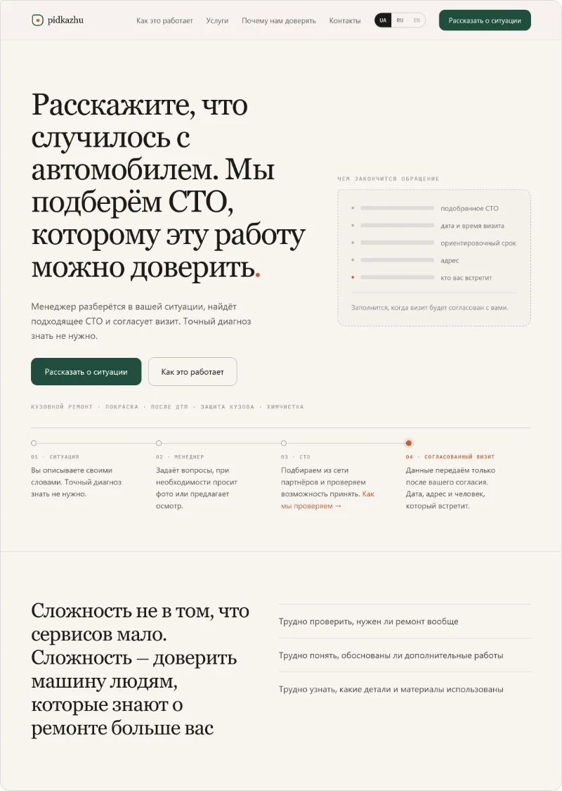 01 / 08Version 1 · 1 Sep
Warm paper, serif type, hairlines. Clean – and flat.
 02 / 08Polish · 8 Sep
Wider container, calmer spacing. Same formula.
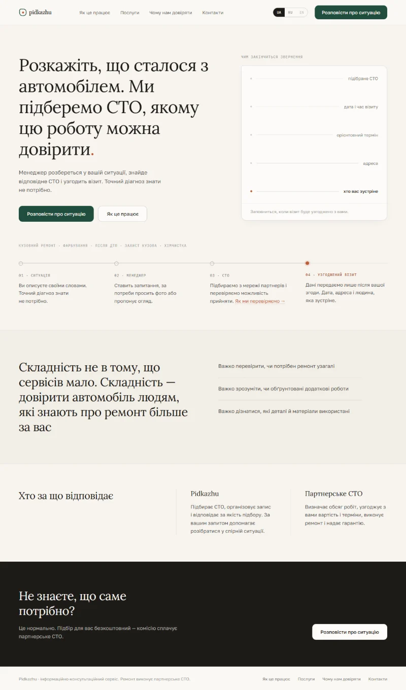
 03 / 08Iteration V2
Green responsibility band, numbered steps. More contrast, same rhythm.
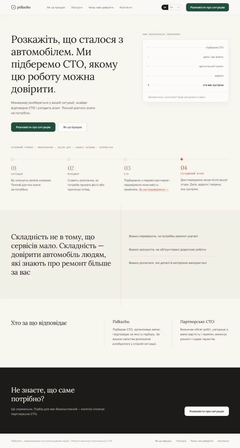 04 / 08Iteration V3
Problem section on its own surface, split layout. Tidier, not bolder.
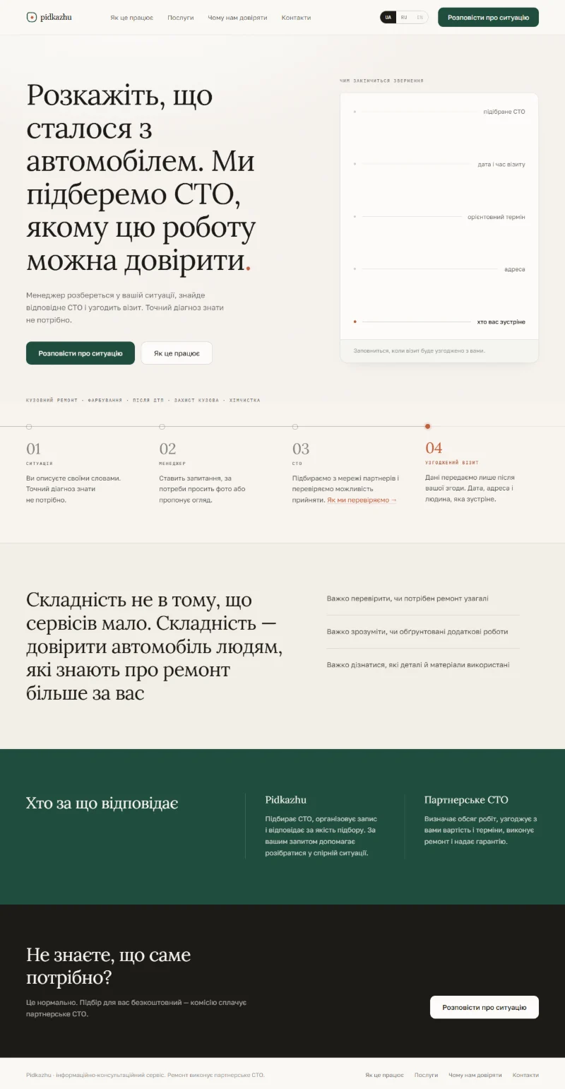
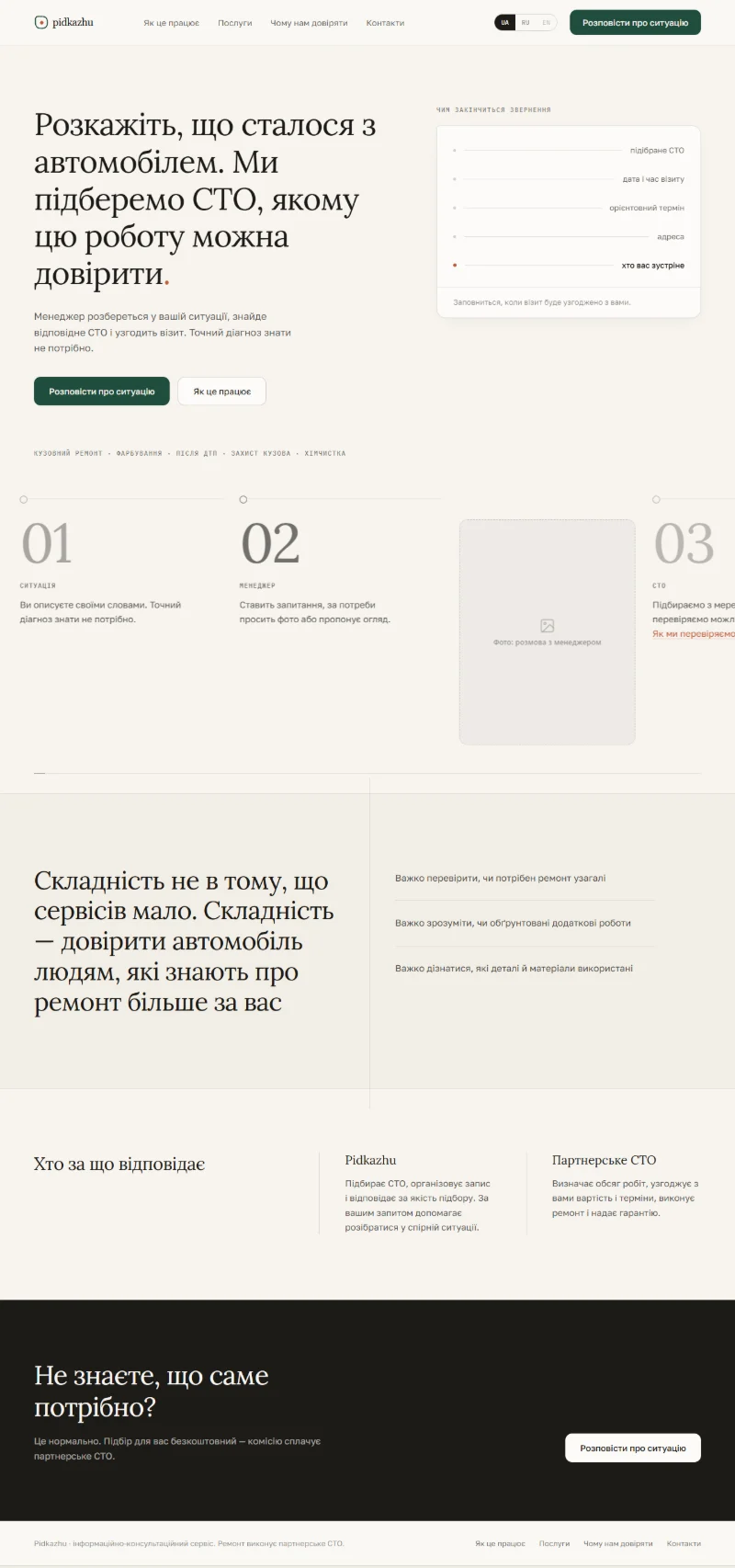 05 / 08Iteration V4
Large numerals and space for photos. Images were meant to carry what the system couldn’t.
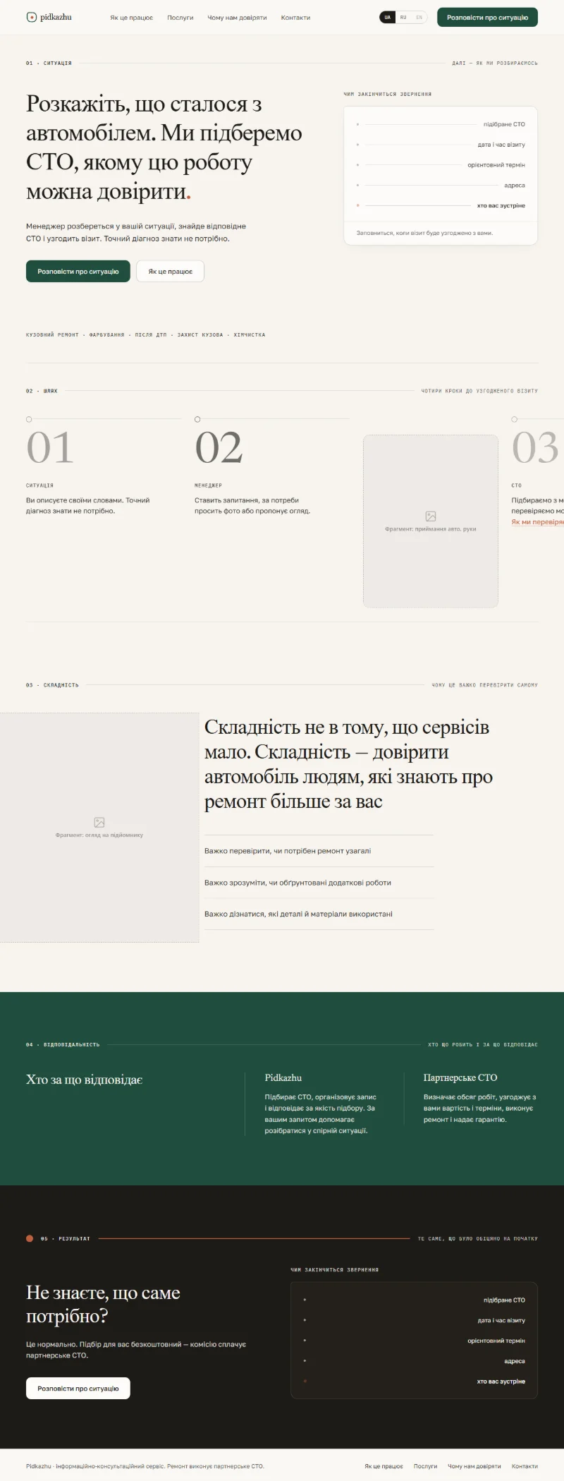 06 / 08V5 Editorial · 10 Sep
Chapters like a magazine, after a study of eight references. Clearer, but still quiet.
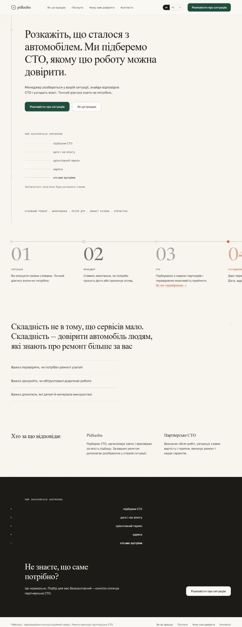 07 / 08V6 Bearing · 12 Sep
Bearing as a line running through the page. Strong as a concept, visually still paper.
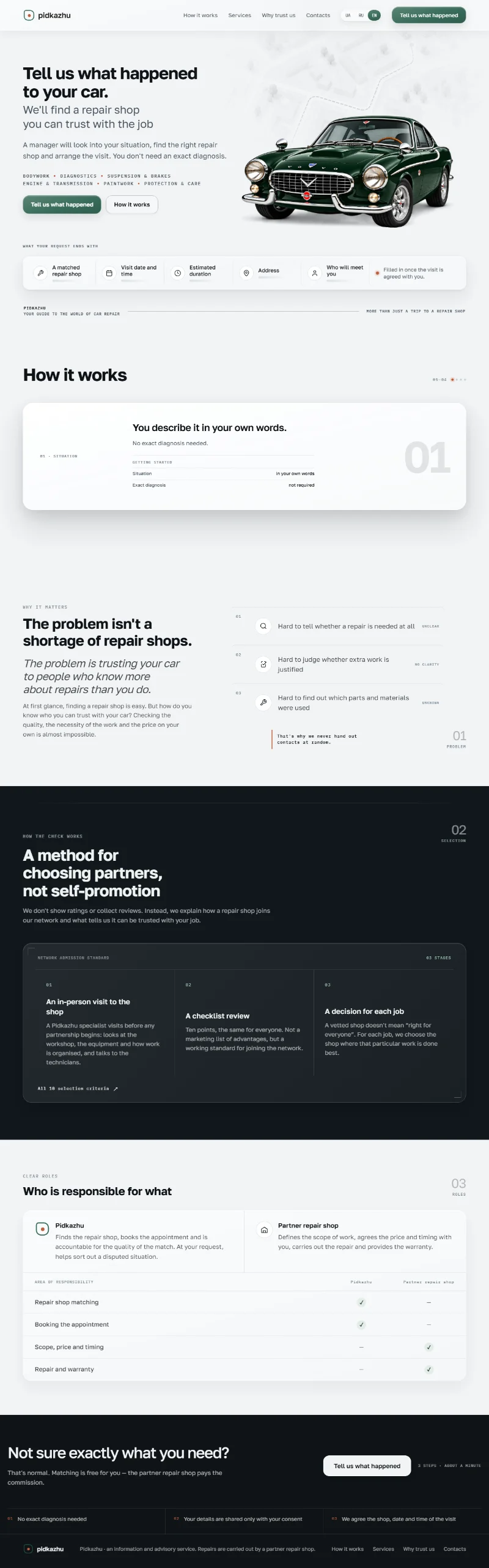 08 / 08New system · live
Cool surfaces, one grotesque, dark sections – and the car as the central object.
Breaking my own rule
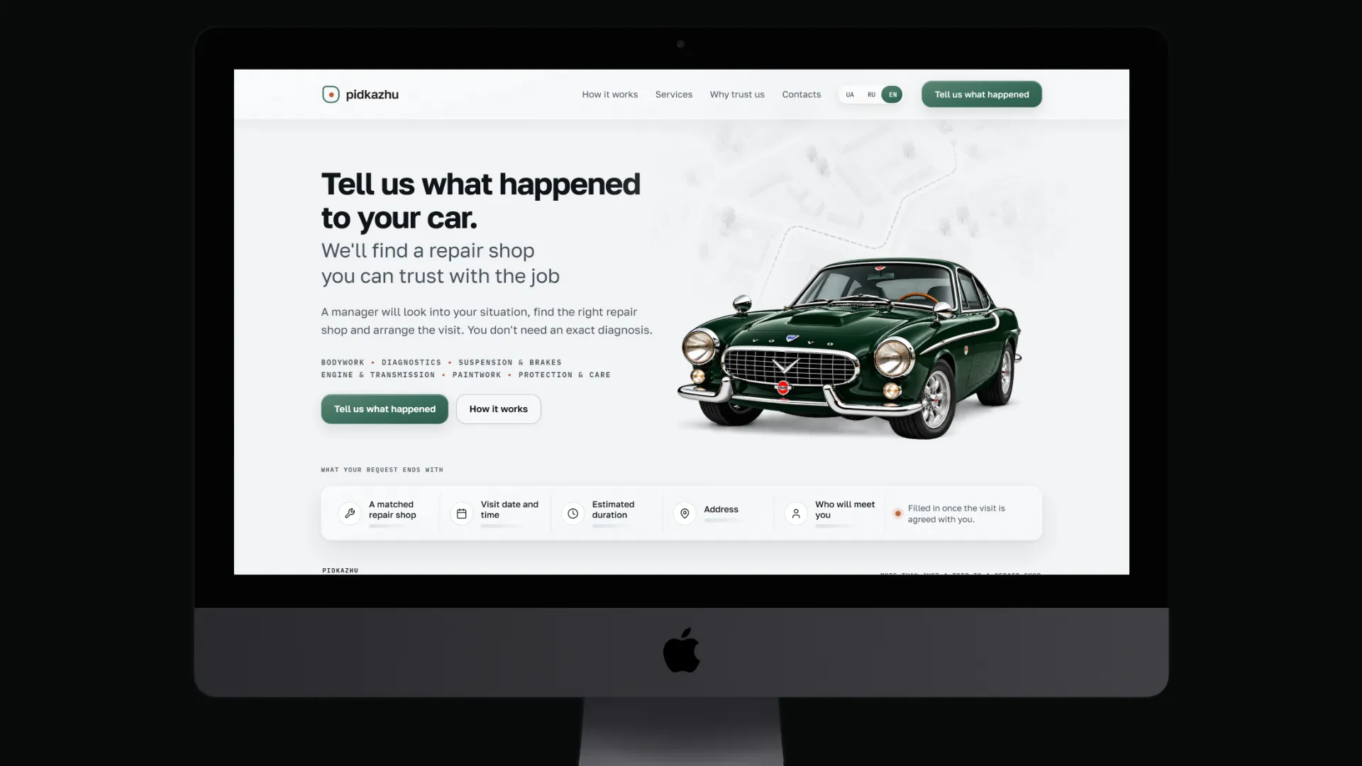
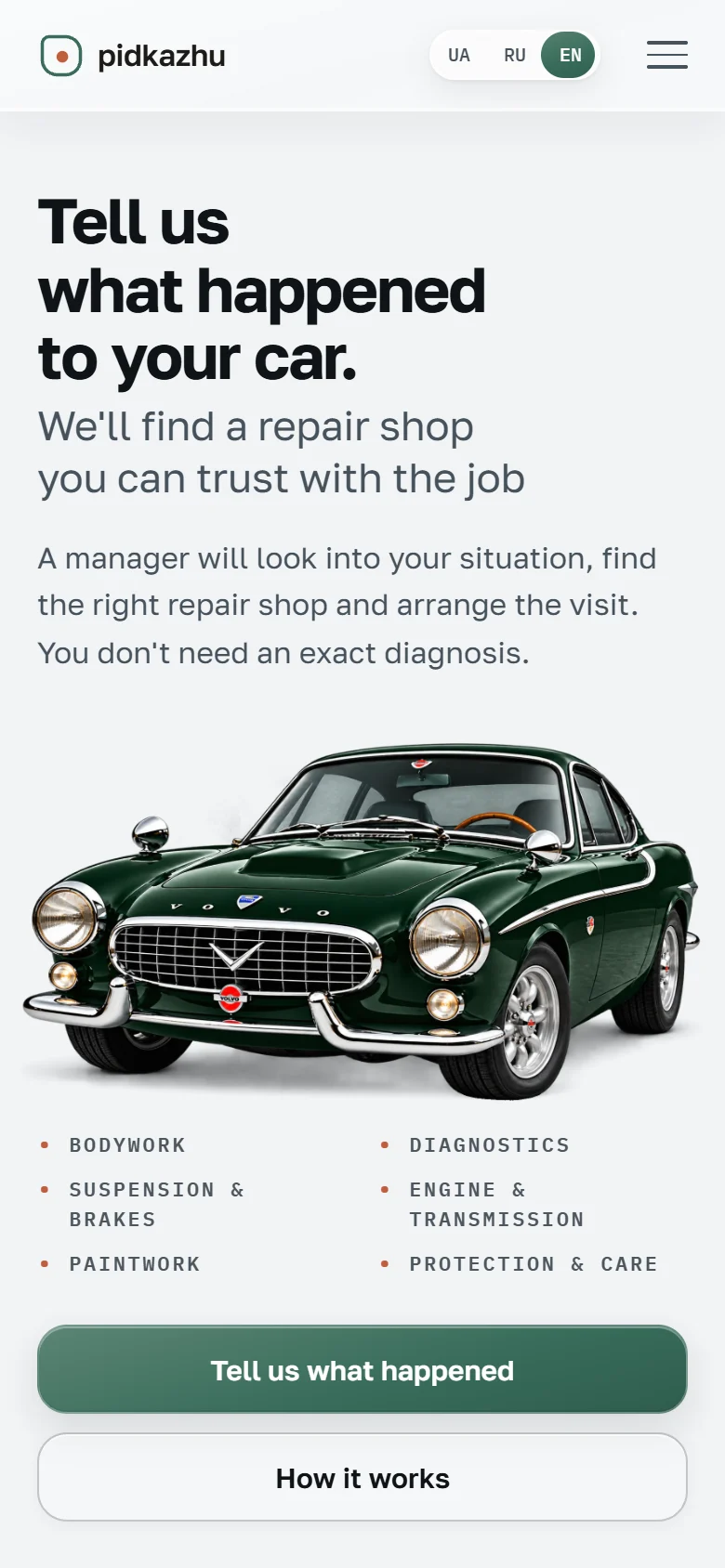
So the design system was rebuilt from scratch – including a rule I had set myself: “no cars”. A single, calm vehicle gives the topic a face at once, without sliding into car-dealer clichés. Deliberately not a supercar but a Swedish coupé from the 1960s, the P1800: one single owner drove this model more than 3 million miles – thanks to regular care at workshops he trusted. That is exactly the idea behind Pidkazhu: reliability comes not from the car, but from the service around it. Product rules, copy and Bearing stayed untouched.
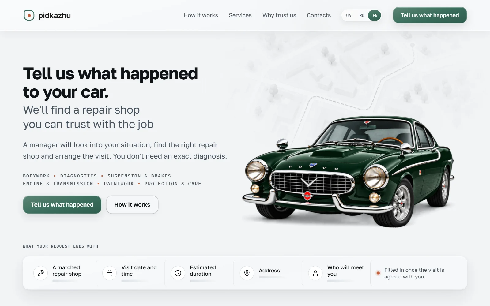
New system, same rules
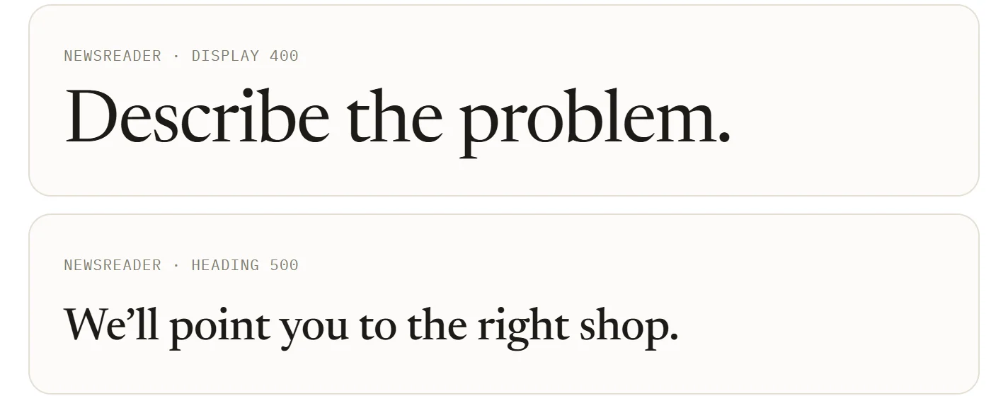
Cool silver-grey instead of warm paper, a single grotesque instead of serifs, dark sections for rhythm. The green was taken straight from the paint of the hero car, so brand and image form one palette.
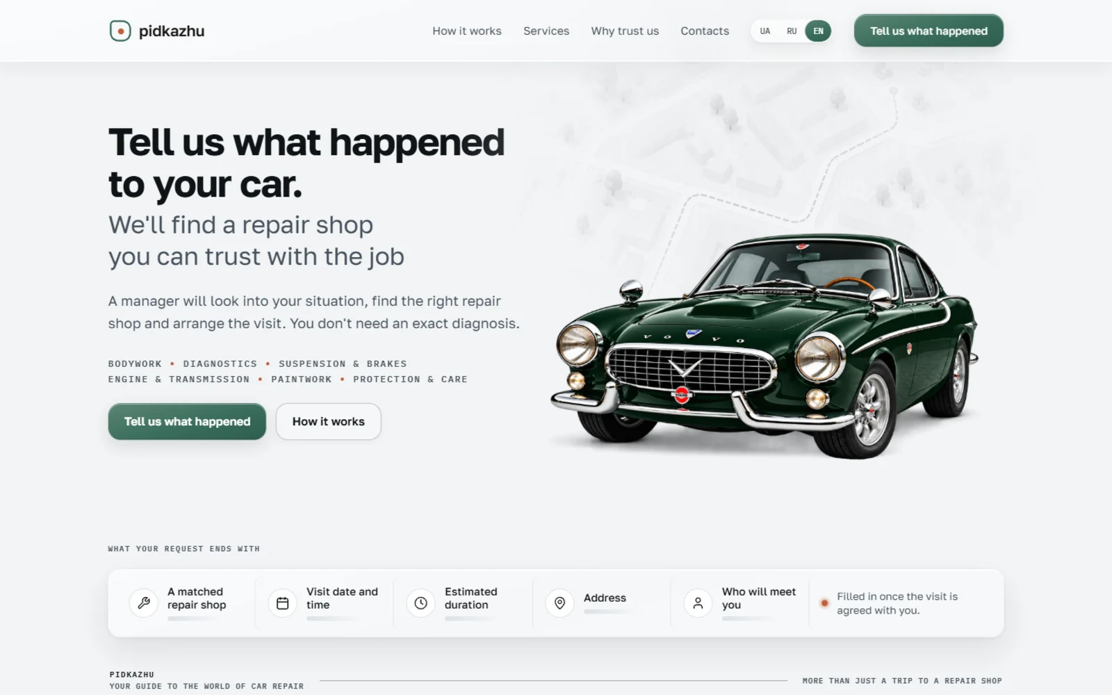
The first screen
The car as a calm main object, with the result fields right below it: shop, appointment, address, who will meet you. Under the cursor it turns into an X-ray lens – the technology appears under the paint.
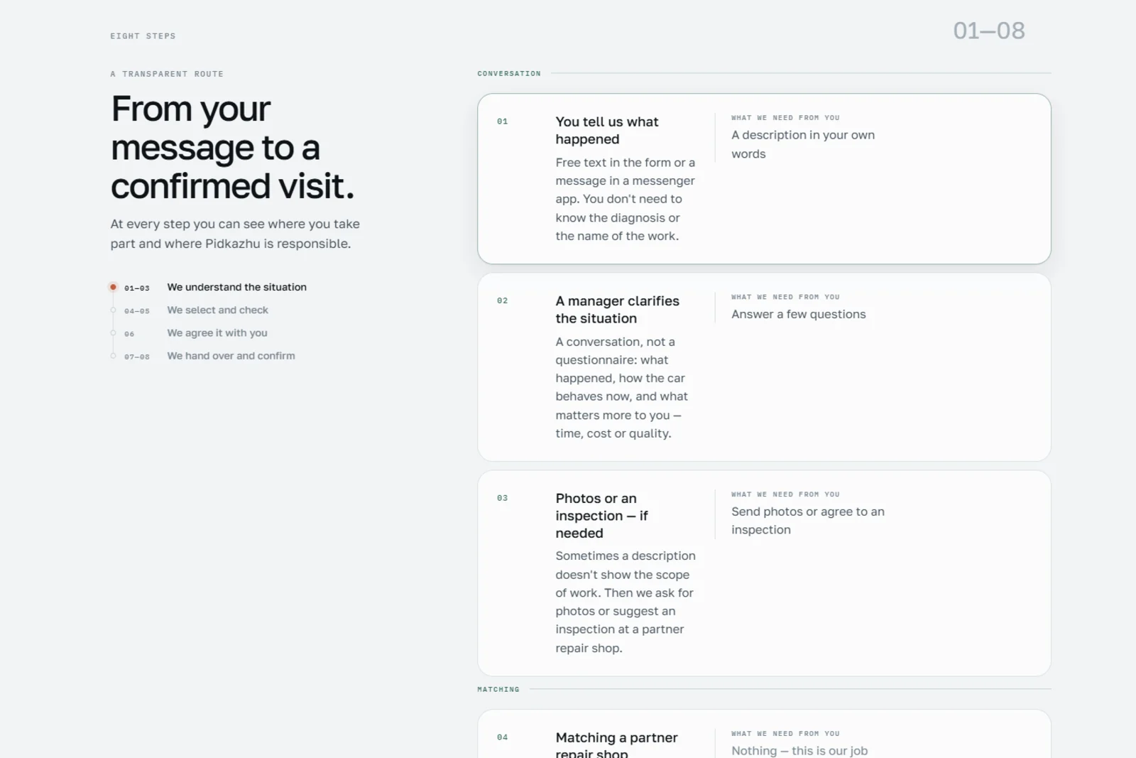
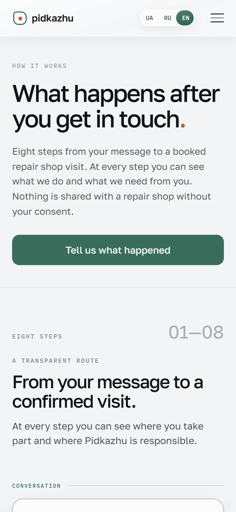
The route in eight steps
Instead of “we find the best shop”, the page shows every step: what Pidkazhu does and what the customer has to contribute – usually nothing.
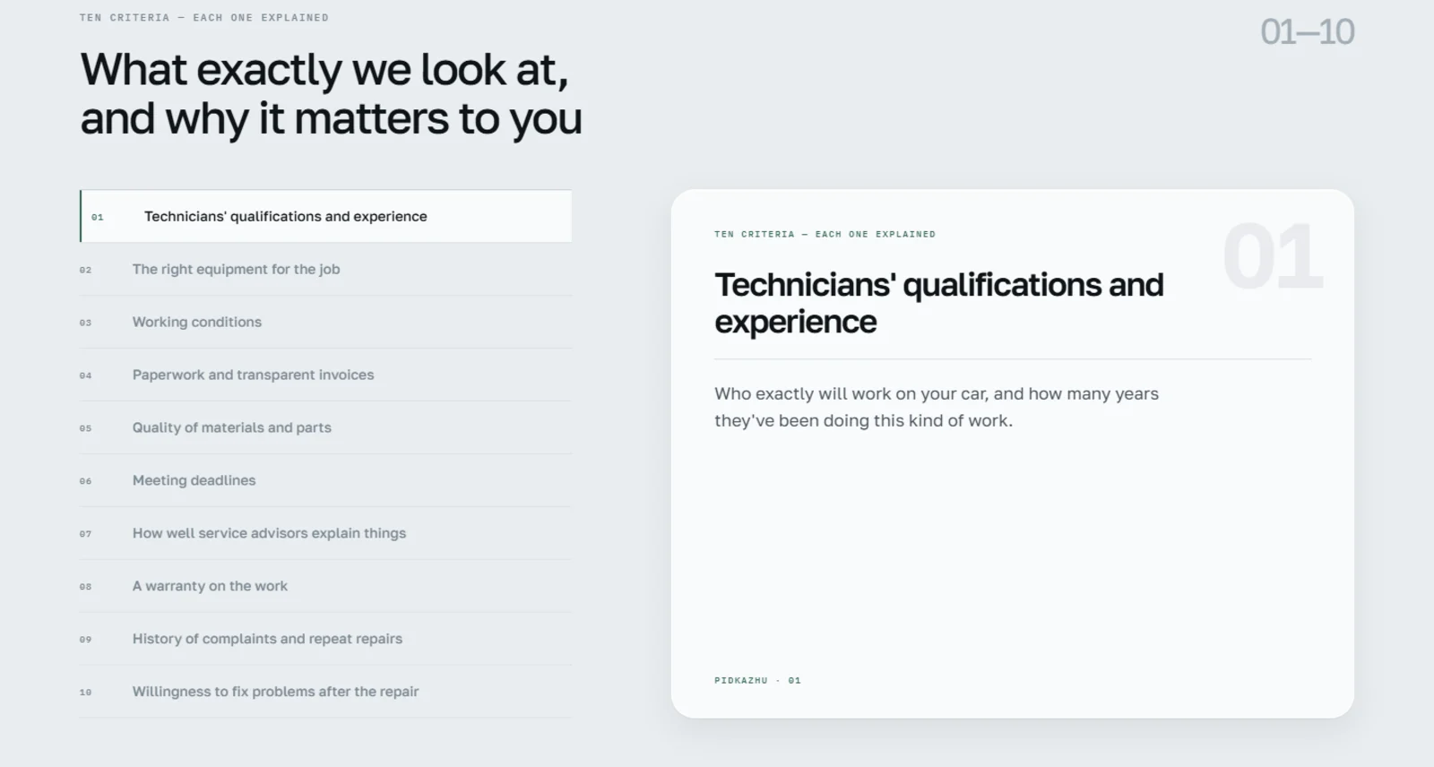
Ten criteria instead of stars
Qualifications, equipment, transparent invoices, warranty: each criterion is explained on its own – with the answer to why it matters to the customer.
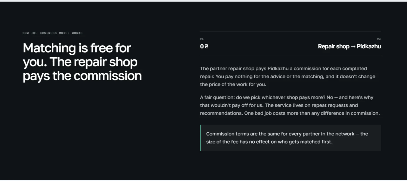
The business model in the open
Who pays the commission and why it doesn’t sway the choice: the website answers the awkward question itself, before the customer asks it.
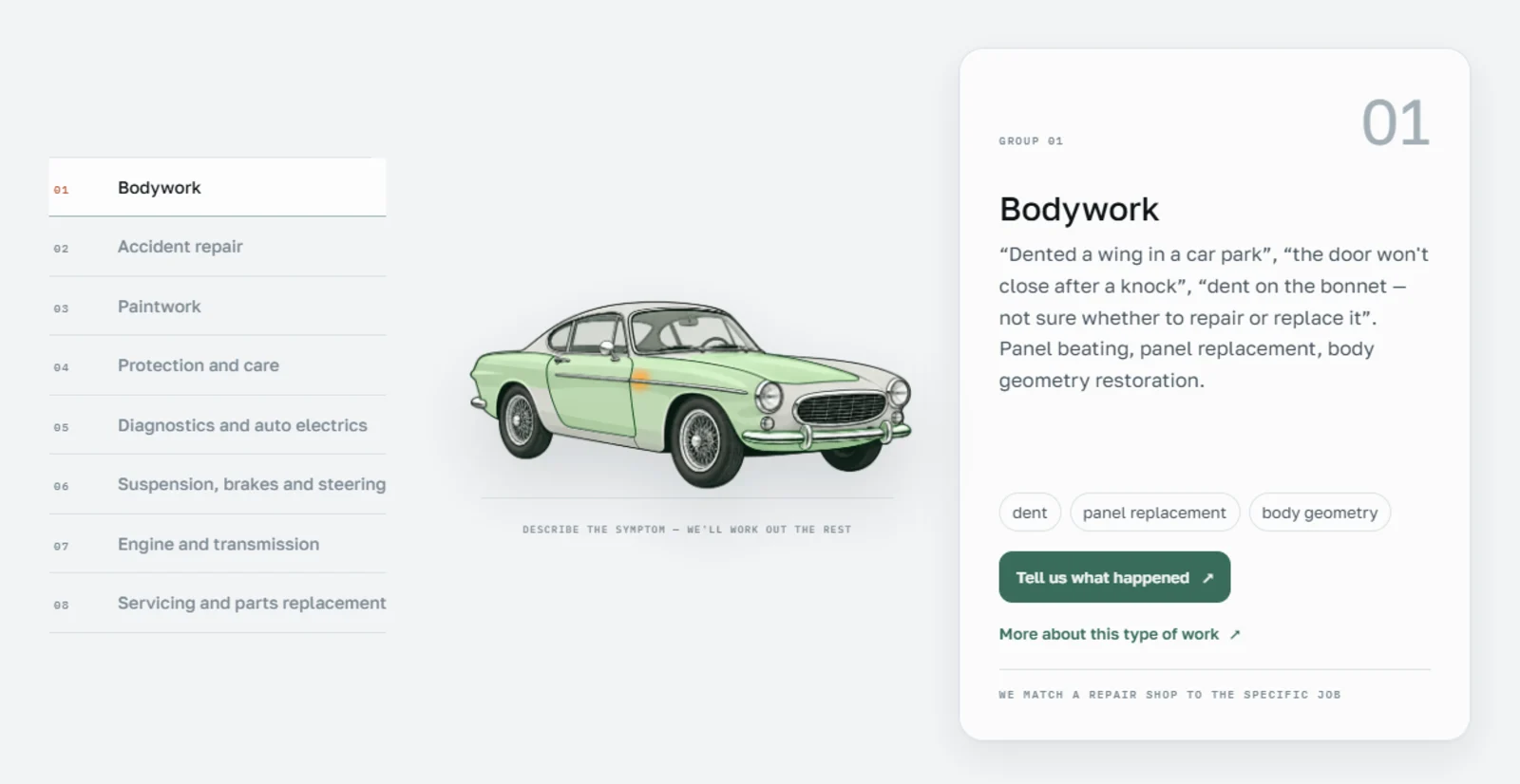
Service atlas
One car, eight layers: each service group marks the area of the vehicle it concerns. Nobody needs to know what the broken part is called.
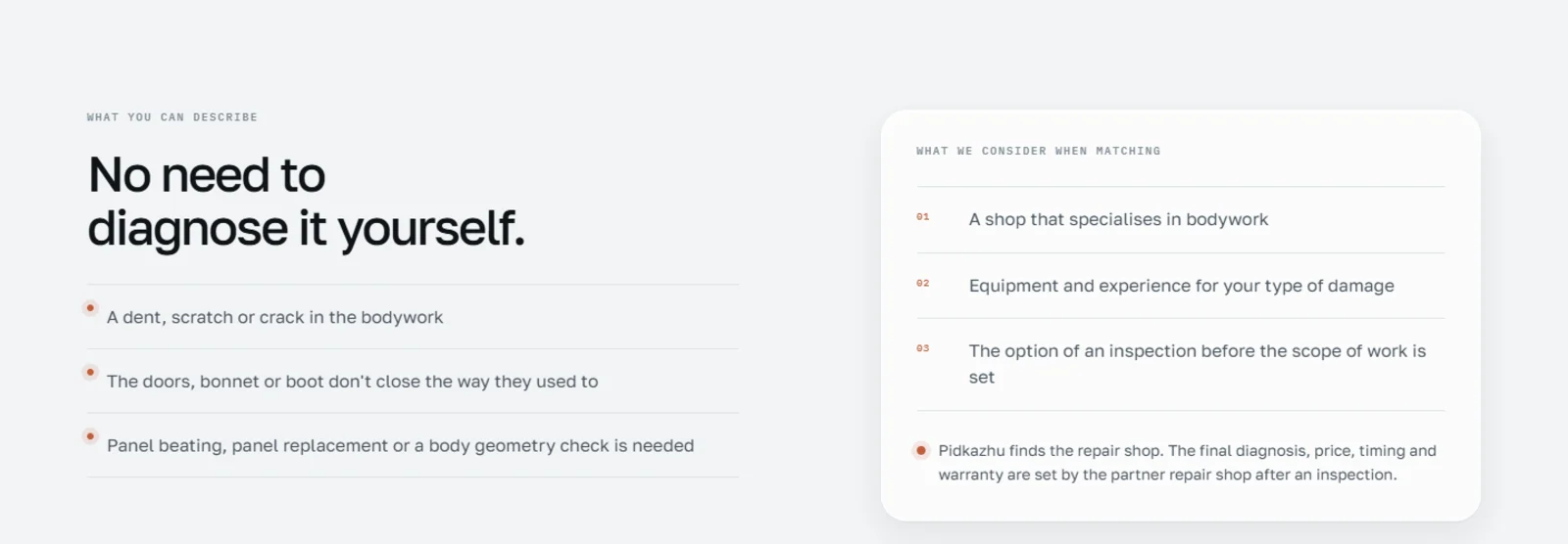
A page per service
Eight service pages in three languages with typical symptoms and matching criteria. They capture search traffic without promising what only the shop can deliver.
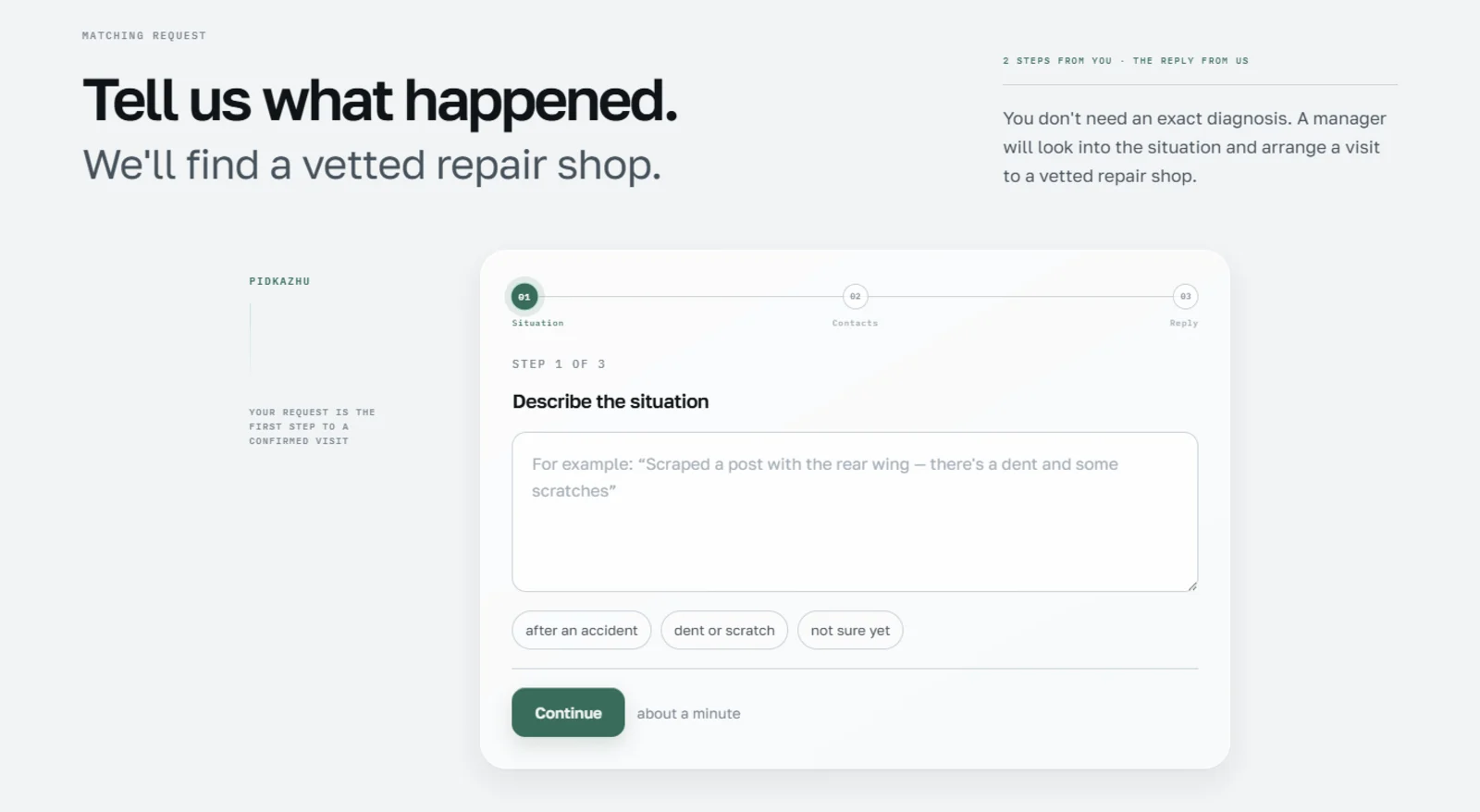
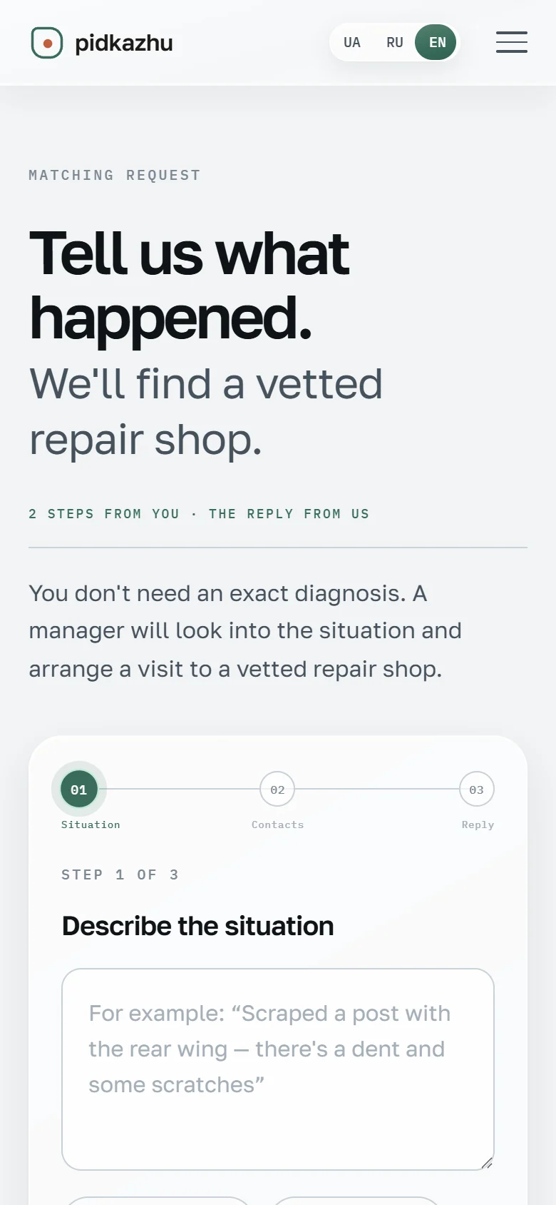
A request in two steps
The situation in your own words, suggestions as chips, then contact details. No exact diagnosis needed.
Designed for mobile first
Fast, three languages, no ballast
The website is statically built and loads fast; the request form runs on a small custom PHP backend at the client’s Ukrainian host.
What the client received
Not a template but a thought-through product – from the first rule to the last animation. There are no business figures yet; the website has been live since September.
Discuss a Project
Let's find out together how UX and clear information architecture can improve your product.
Start Strategy Session